感谢 Y·Design(联系邮箱:1792955283@qq.com) 予gooood分享以下内容 。
Appreciation towards Y·Design(contact:1792955283@qq.com) for providing the following description:
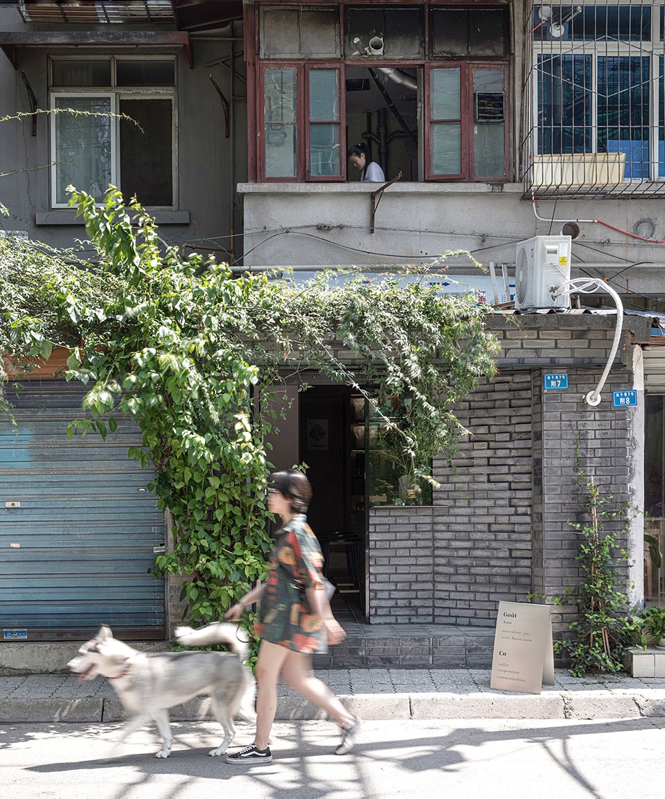
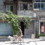
Gout咖啡位于成都安静的柿子巷,与宽窄巷子仅一街之隔,却是完全不同的气场。烟火味十足,楼上住着几十年未搬迁的老居民,整条街生意最好的是街口的麻将馆。其中这间16平米的小铺子便是Gout。
The quiet Shizi Lane in Chengdu is only one street away from Kuanzhai alley, but it is a completely different atmosphere. There are many old residents who have not been relocated for decades. The best business in the street is mahjong hall. The 16 square meter shop is gout.
▼街道视角,street view © 李恒
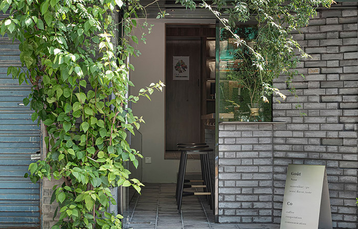
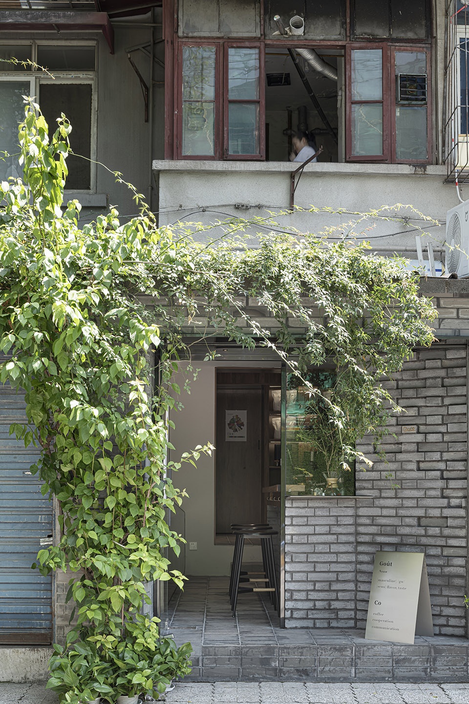
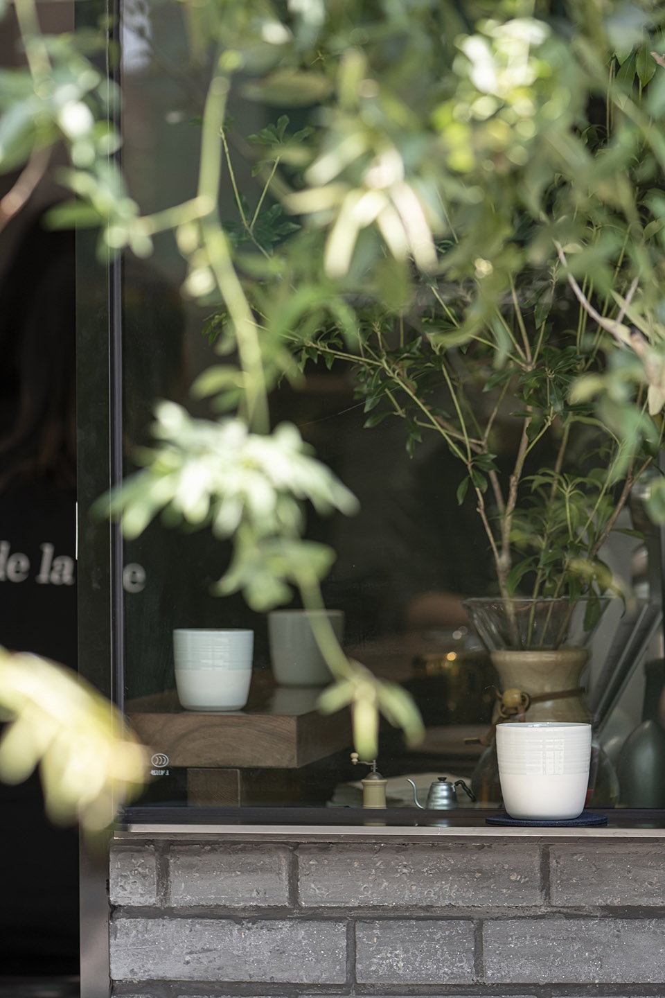
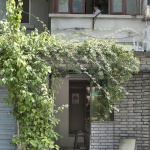
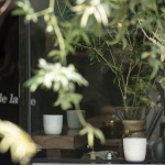
Gout选择在这里,按主理人的说法是“我们不建议客人外带,也不建议他们在这里坐下喝下午茶,只是希望感兴趣的人前来品鉴、交流。”用青砖这个材料来呼应柿子巷,希望它是能够被环境完全包裹的。店铺虽小,却依然选择让出一个身位,增加进入的仪式感,给客人留一点余地。门口会写上daily menu。今日烘培的豆子,是否符合你的口味。
▼店铺入口,entrance © 李恒
Gout chose to stay here. According to the host, “we don’t recommend that guests take out or sit down for afternoon tea. We just hope that interested people will come to appreciate and communicate.” This material is used to echo persimmon lane, hoping that it can be completely wrapped by the environment. Although the shop is small, it still chooses to give up a body position to increase the sense of ceremony and leave some room for guests. Daily menu will be written at the door. Today’s baked beans, whether to meet your taste.
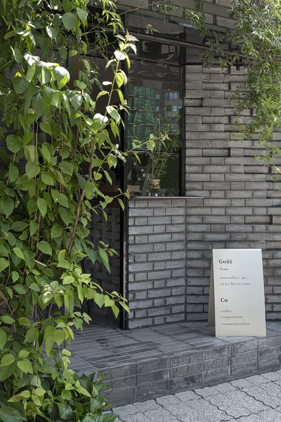
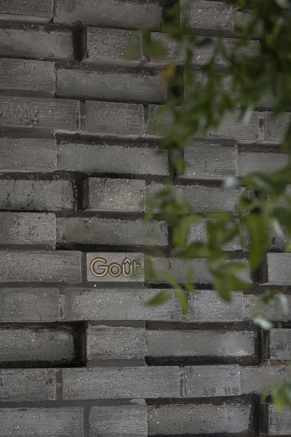
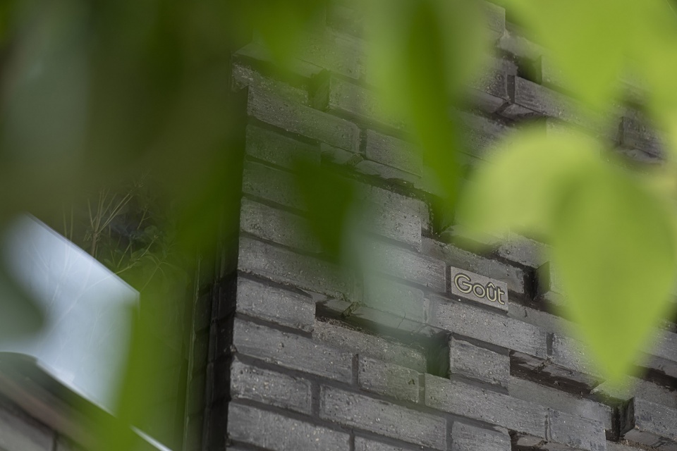
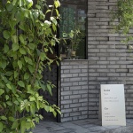
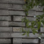
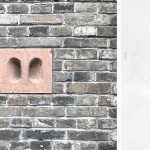
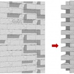
▼青砖墙面细节,brick wall details © 李恒
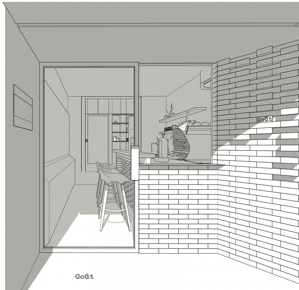
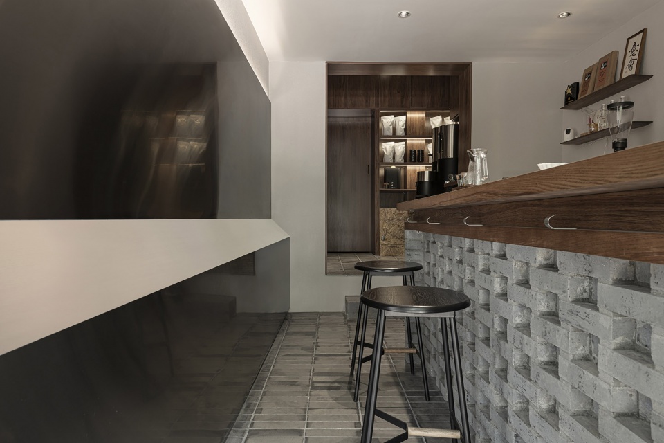
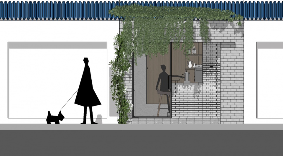
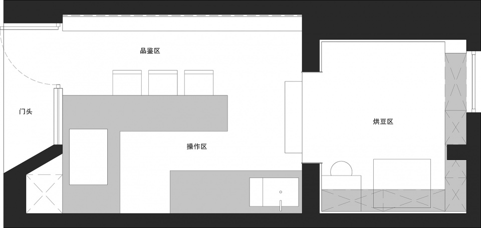
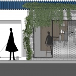
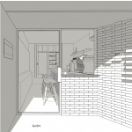
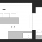
青砖垒成吧台,靠坐的不锈钢面在视觉上给予一些延伸感。烘豆区与外间用立面上的材料予以区分,加强空间层次。入口、品鉴区、烘豆区呈递进关系,门头有一定遮挡,给人神秘感,丰富空间视觉。提取巷子里的青砖元素,让店铺更具当地性,门头内凹,掩映在植物和砖墙中。
▼入口空间立面图,entrance elevation © Y·Design
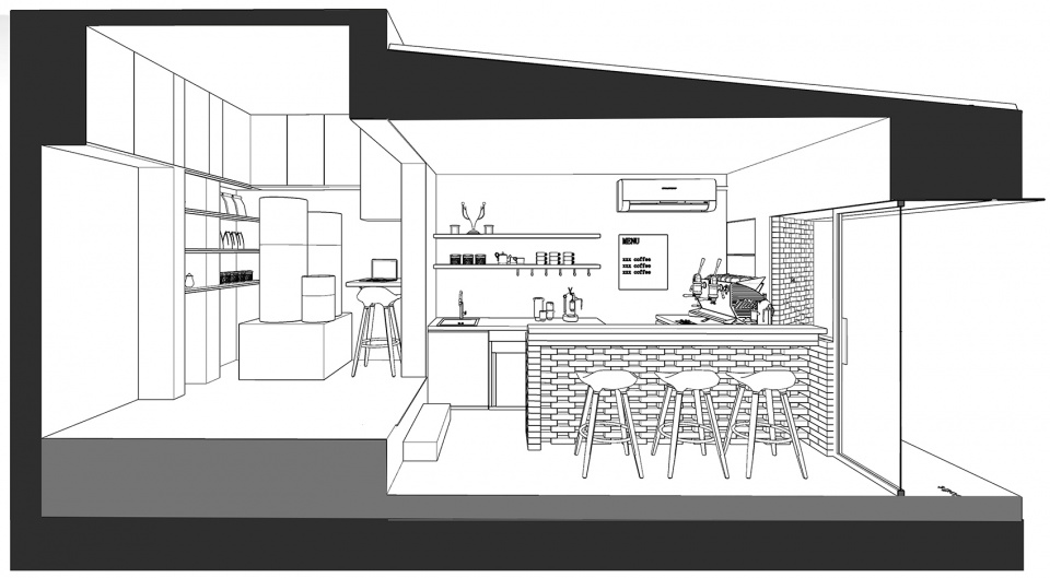
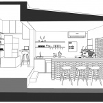
▼剖面图,section © Y·Design
Green brick base into the bar, sitting on the stainless steel surface in the visual to give some sense of extension. The materials on the facade should be used to distinguish the bean baking area and the outer room, so as to strengthen the spatial level. The entrance, tasting area and bean baking area present a progressive relationship. The front of the door is blocked to give people a sense of mystery and enrich space vision. The green brick elements in the alley are extracted to make the shop more local. The door is concave and hidden in plants and brick walls.
▼室内一览,overview © 李恒
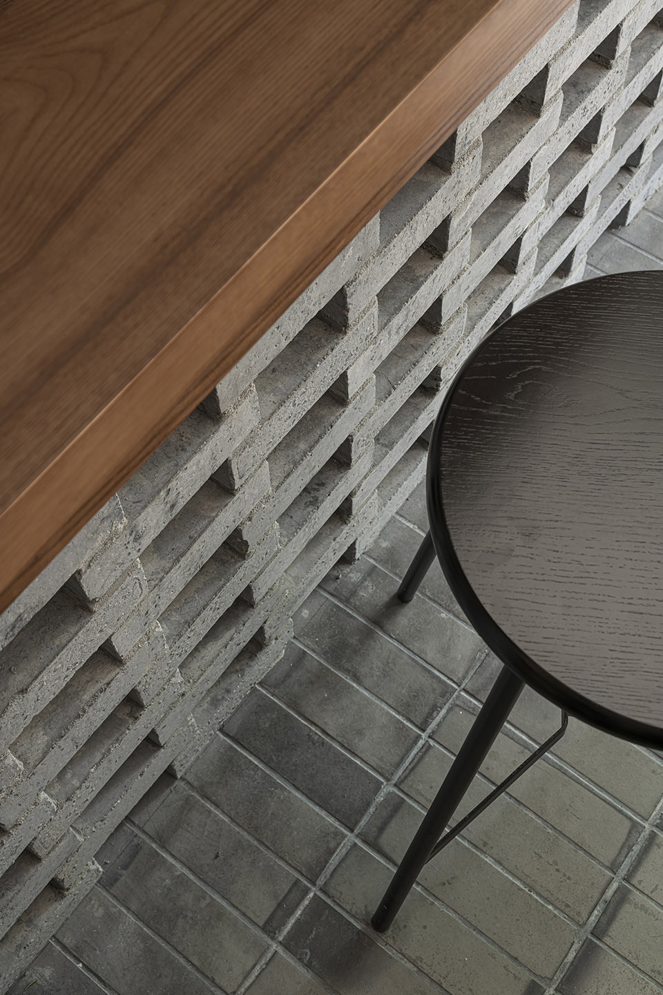
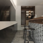
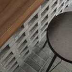
▼吧台和座椅细部,bar and seats detail © 李恒
吧台拉近客人与咖啡师之间的距离,便于交流。但座位着实有限,固利用墙体做造型让人可以靠坐,缓解就坐压力。烘豆区整体木色,加上户型本身的抬高,视觉上呈现出“盒子”的状态,让烘豆这个空间成为独立的存在,暗示“烘豆”这一过程的仪式感。
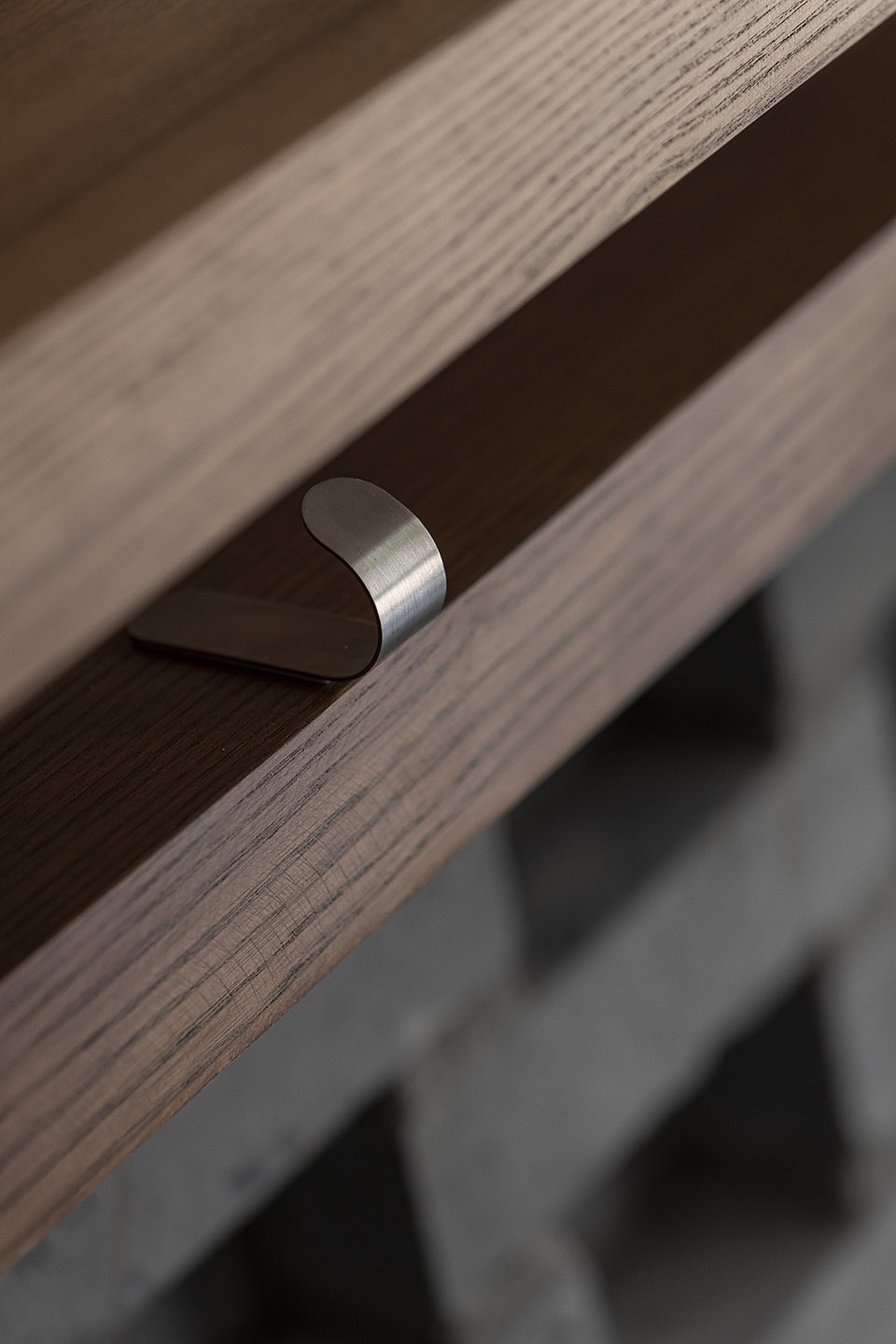
▼其他细节,other details © 李恒
The bar can shorten the distance between guests and baristas, and facilitate communication. But the seat is really limited, solid use of the wall to do modeling, so that people can rely on sitting, ease sitting pressure. The overall wood color of the baked beans area, together with the elevation of the house type itself, visually presents a “box” state, which makes the space of baked beans an independent existence, indicating the ritual sense of the process of “baking beans”.
▼临街立面,elevation © Y·Design
▼平面图,plan © Y·Design
项目名称:成都·Gout&Co
设计方:Y·Design
项目设计 & 完成年份:2020.5
项目地址:成都市青羊区柿子巷
建筑面积:15㎡
摄影版权:李恒
材料:青砖、水曲柳、不锈钢
More:Y·Design(contact:1792955283@qq.com)
