非常感谢 nendo 予 gooood 分享以下内容。更多关于他们:nendo on gooood。
Appreciation towards nendo for providing the following description:
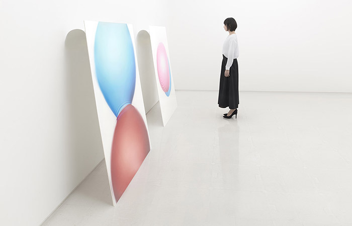
该项目是为摄影师吉田明弘(Akihiro Yoshida)个展进行空间及图象设计。该摄影展以“弹力(RESILIENCE)”为主题,包含一系列捕捉了水球碰撞瞬间的高速摄影作品,展现出瞬间的弹力与反冲。展览的设计也遵循了同一主题。
Spatial and graphic design of photographer Akihiro Yoshida’s private exhibition. The exhibition design followed the theme of the exhibition, which was titled “RESILIENCE” from the elasticity and recoil portrayed in the series of high-speed photography work capturing the aspect of water balloons at the moment of collision.
▼摄影展展陈空间,exhibition area ©Akihiro Yoshida
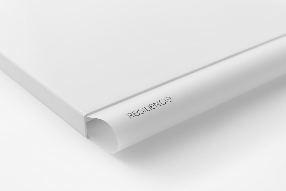
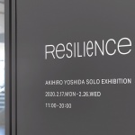
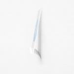
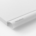
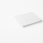
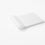
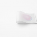
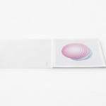
展览标示的设计就像是将文字从两端施加压力,挤压至中心。摄影展目录的封面选用了高弹力纸张。当纸张被强制塞进封壳中,纸张会因为弹性而形成独特的拱形侧脊。
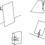
▼设计草图,sketch ©nendo
The logo was designed as though pressure applied from both ends of the text were compressing the center. Next, a paper with high elasticity was chosen for the catalog cover and forced into the case to create a perpetual state of resilience inside the case, which resulted in producing a uniquely arched spine.
▼展览目录采用弹力高的纸张,a paper with high elasticity was chosen for the catalog cover ©Akihiro Yoshida
▼纸张的弹性形成特殊的拱形,paper with high elasticity producing a uniquely arched spine ©Akihiro Yoshida
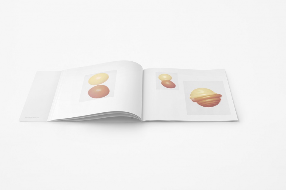
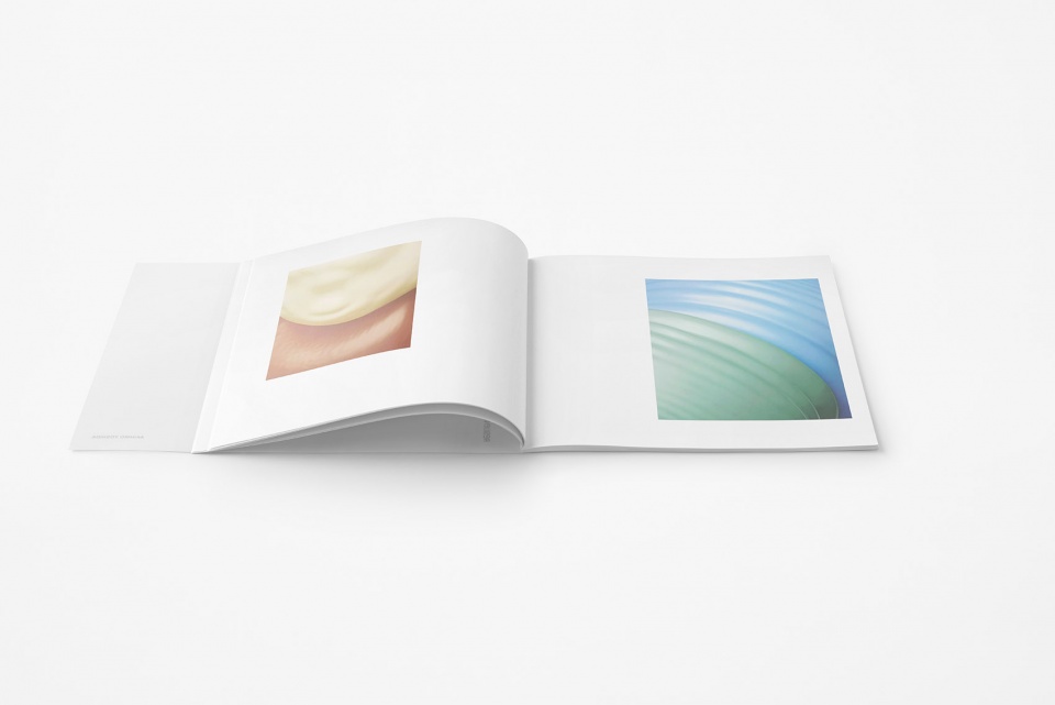
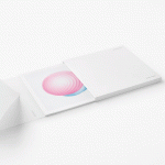
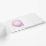
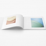
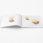
▼目录内页,content of the catalog ©Akihiro Yoshida
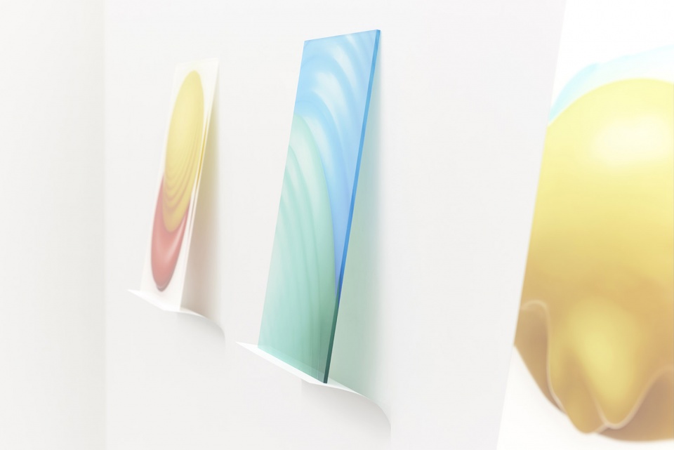
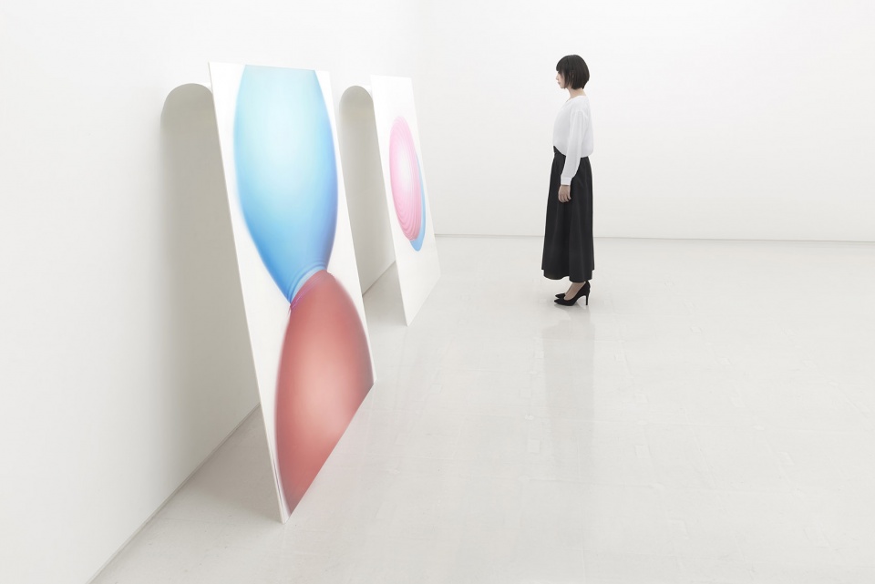
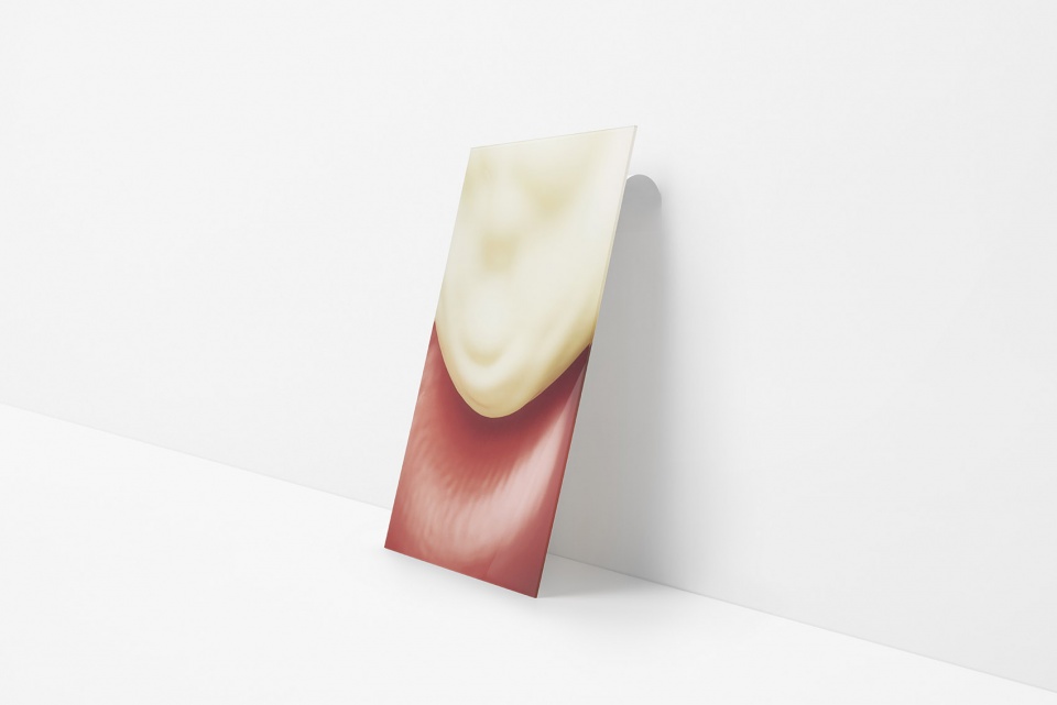
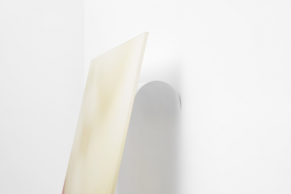
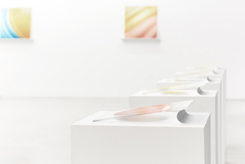
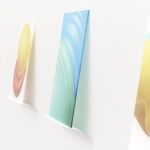
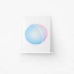
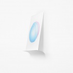
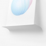
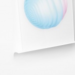
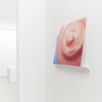
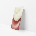
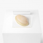
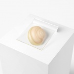
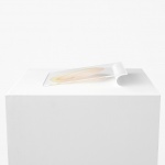
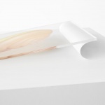
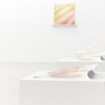
因为这次展出的作品都高品质地印刷在了亚克力板上,所以设计计师为作品设计了灵活的,具有反弹力的薄金属支撑板,而不是将它们放置在固定的框架上,或是挂在画架或墙上。在墙上展示的作品,根据不同重量采用了不同的金属板,以此达到平衡,例如较小的作品使用厚度为0.2mm的不锈钢板,较大的作品则使用厚度为0.3mm的不锈钢板,以此类推。此外,放置在展台上的作品则使用0.08mm的金属板支撑于一侧,使作品投下适当的阴影,增强作品的悬浮感。
当参观者上前仔细欣赏每件作品时,动作中带来的空气的震动会使作品轻微晃动。展陈的设计目标即加强摄影作品“弹力”的精髓。
▼轻薄的金属板支撑起亚克力板上的作品,thin and light metal plate supports the works on the acrylic plate ©Akihiro Yoshida
▼金属板具有高弹性,metal plate with high elasticity ©Akihiro Yoshida
▼放置在地板上的作品也由金属板达到微妙的平衡,works placed on the floor are also delicately balanced by metal plates ©Akihiro Yoshida
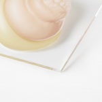
▼金属板弯折细节,detail of the curved metal plate ©Akihiro Yoshida
Because the exhibited works were high-resolution prints on acrylic panels, the pieces were displayed by supporting them with flexible and rebounding thin metal plates rather than by fixing them onto a surface such as framing, hanging from a picture rail, or wall mounting. For works displayed on walls, a delicate balance was sought by adjusting the flex according to the weight of the pieces-using stainless steel plates 0.2 mm thick for smaller works, 0.3 mm thick for relatively larger works, and so on. Further, works placed on exhibition stands were made to hover on one side by using 0.08 mm panels, to cast shadows of water balloons and increase the sense of buoyancy.
When viewers move in front of each work, consequent vibrations and disturbances in the air make the pieces sway. The designs were produced with the aim to enhance the essence of the works.
▼放置在展台上的作品则使用金属板支撑起一侧,works placed on exhibition stands were made to hover on one side by panels ©Akihiro Yoshida
▼作品的悬浮感,the sense of buoyancy ©Akihiro Yoshida
▼支撑细节,detail of the supporter ©Akihiro Yoshida
More: nendo 更多关于他们:nendo on gooood
