感谢 裸筑更新 对gooood的分享。更多关于:RoarcRenew on gooood
Appreciation towards RoarcRenew for providing the following description:
这次裸筑收到的委托命题,是为国货电视机品牌——海信——位于青岛的“海信科学探索中心”营造一个复合型商业空间,包含未来电视展厅、商业入口空间、咖啡区、老电视展区等。
This time, Roarc Renew is commissioned to create a hybrid commercial space for a long-established Chinese TV brand—— Hisense——its HISENSE SCIEN-EXPLORATION CENTER, which includes a commercial entrance space, a future TV exhibition hall, an old TV display area and a coffee shop.
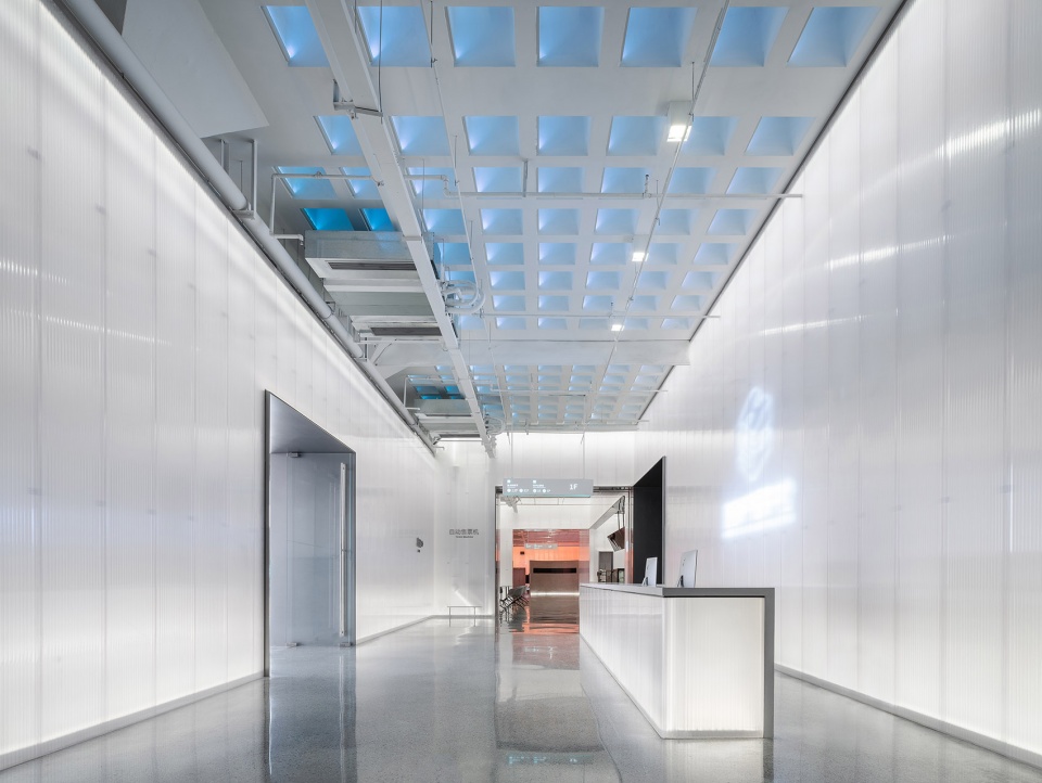
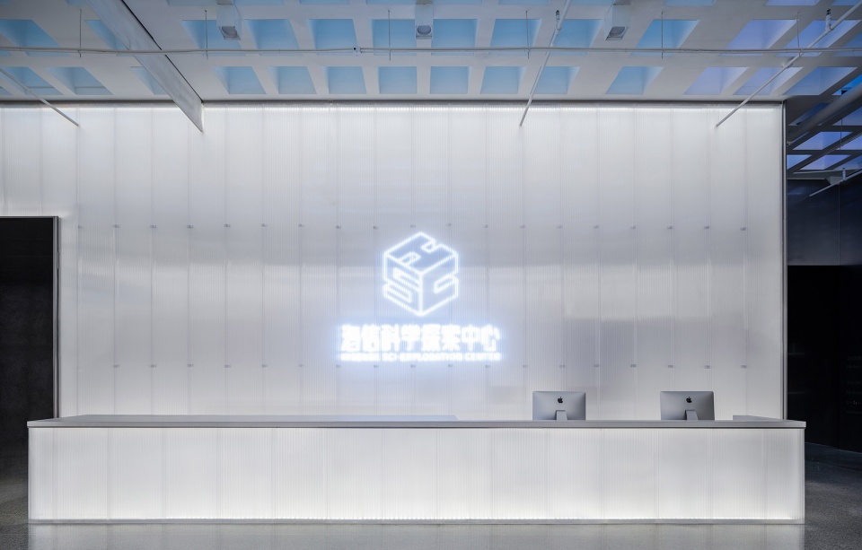
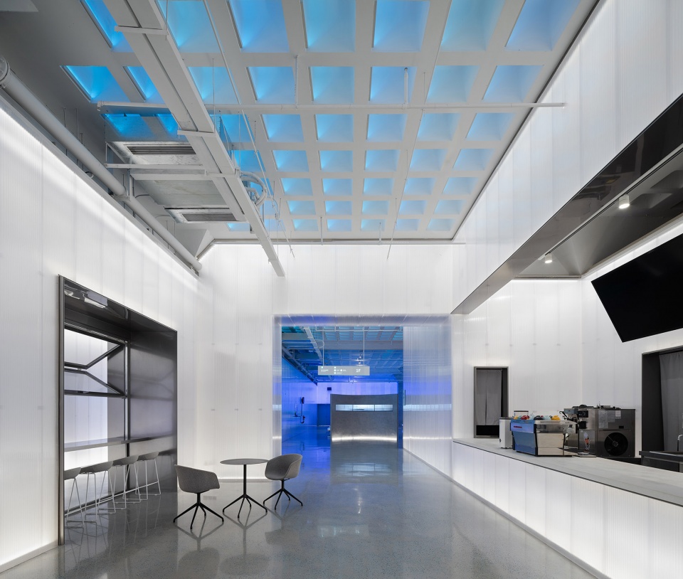
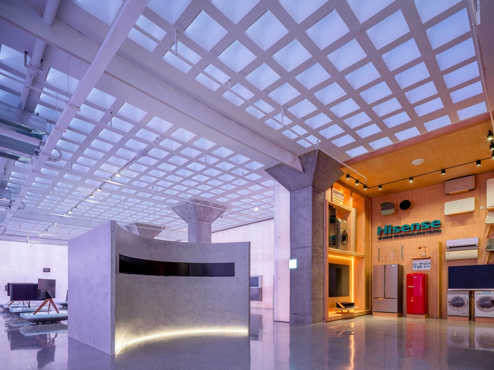
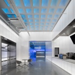
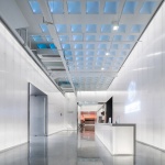
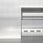
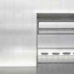
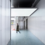
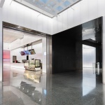
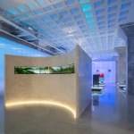
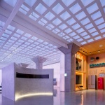
▼展厅接待区,reception area © Wen Studio
空间前身是海信电视工厂,经过数次翻新,建筑立面已与过去大相径庭。不过,空间内部的构造体系依然延续着电视工厂时代的无梁楼板及伞形柱。这两个空间特征,理应被完整地保护下来。
Initially built as the Hisense TV factory, the space has undergone multiple renovations; during the process the façade has changed its appearance completely. However, the internal structure with the girder-less floor and the umbrella columns was well reserved continuing the memory of the old Hisense TV factory. We believe both of these two features should be kept intact to remind people of respecting and protecting the past while unleashing unlimited impossibilities in the future.
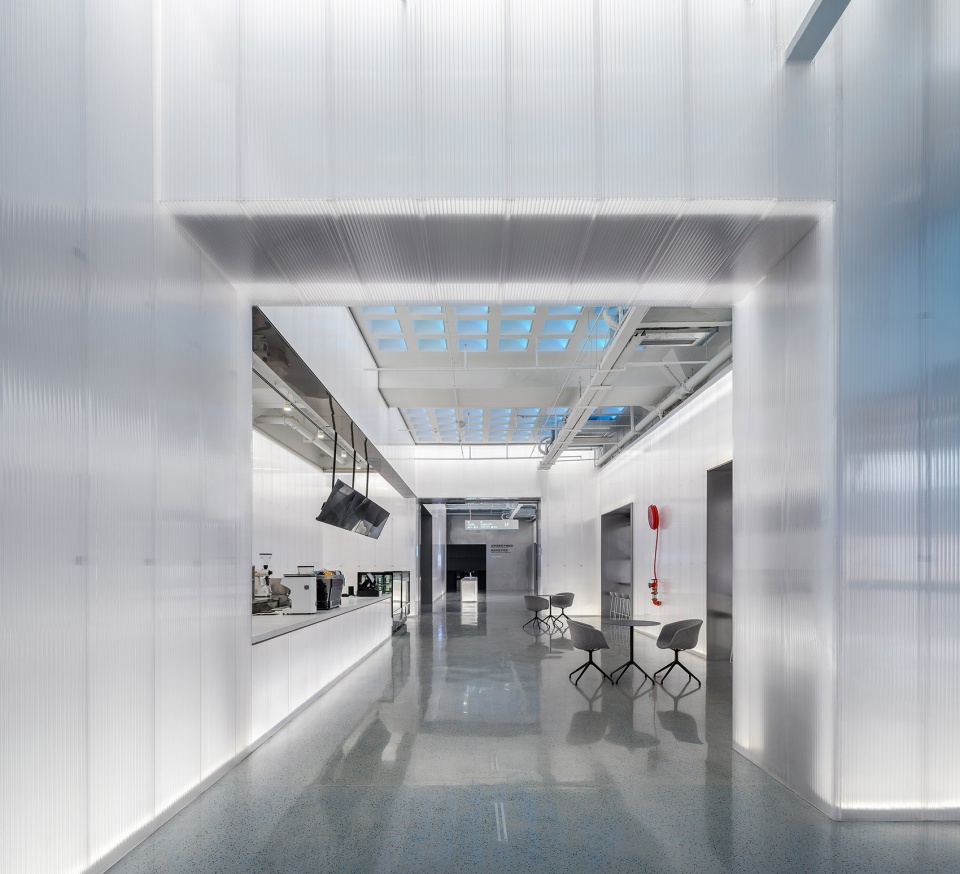
▼咖啡餐饮区,coffee and dining area © Wen Studio
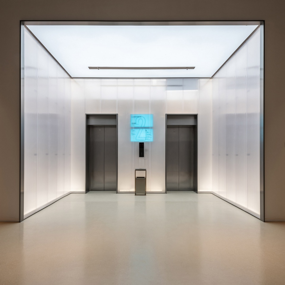
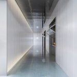
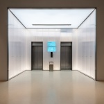
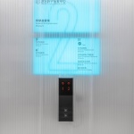
▼电梯间,the lifts © 蝈蝈
为何设计?
What we are designing for?
这是裸筑在接手每个空间都会问自己的一个问题。我们坚持每个空间有其自身的声音,性格,形态。如同上一个项目,南京泰合玺spa馆,我们坚持用红砖自身的泰国属性来发声,而这次海信的属性,是我们设计的切入点。我们在参观完海信电视机发展历史博物馆后,发现了一个被人们忽略的重要信息:电视机在一个多世纪的发展历程里,其实就是其屏幕从模糊到清晰的过程。“从模糊到清晰”的过程,是人类文明发展的过程,也是历史向我们揭示文明精良与糟粕的过程,而我们希望将这样的“经历”保留。
所以,从模糊到清晰,是电视机的生产史,也是海信的发展史,更是其不断精进的结果。
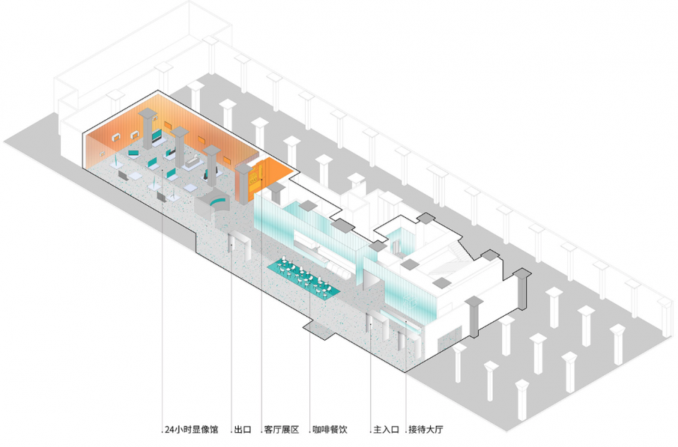
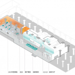
▼空间分区轴测图,space partition axonometric map © 裸筑更新
This is the question that Roarc Renew will always ask ourselves for every project. We believe each space has its own voice, character and form. Just as in the recent project of TaiOursea Laomendong SPA Shop, we stuck to our view to use red bricks as a way to highlight the Thailand attributes. As with this very project, the starting point will be respecting the identity of Hisense as a brand. Our visit to Hisense’s museum of TV development history has led to a not-hard-to-find but ignored information: the TV development history spanning over a century is actually an evolvement from blurred to high definition images, which can be regarded as a glimpse of the civilization process for human kind. Over time, history will tell the better from the worse. But the process itself is a treasure worthy of preservation for future review.
In this sense, the process from blurred to high definition can not only represent the TV manufacturing history, but also Hisense’s development history and its achievements after long-term evolvement.
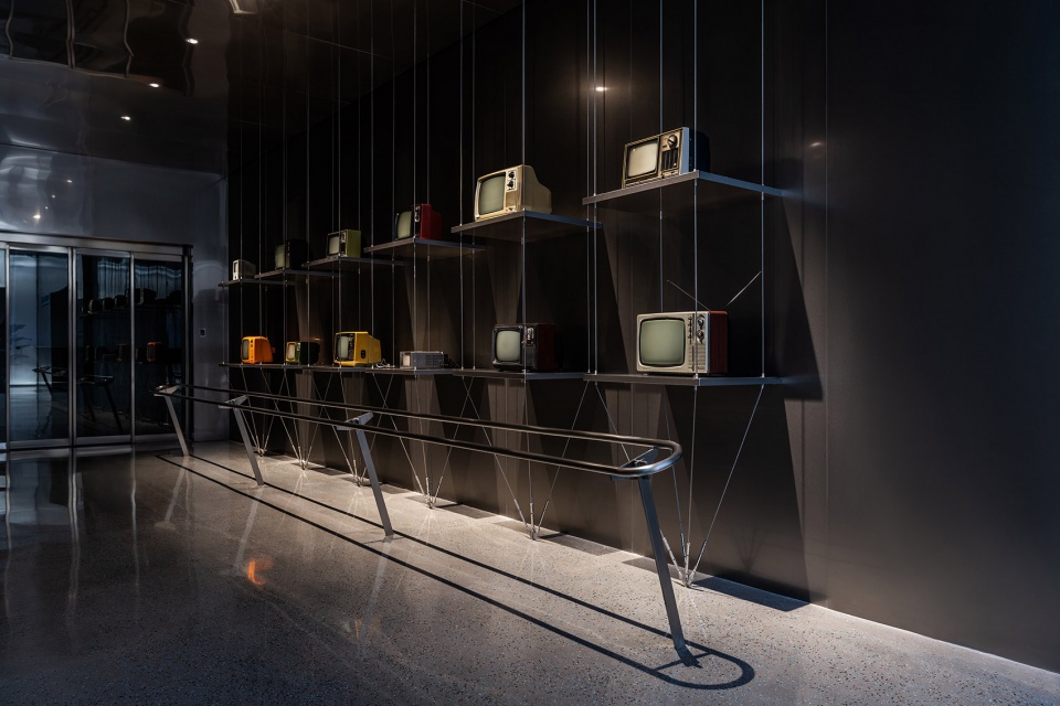
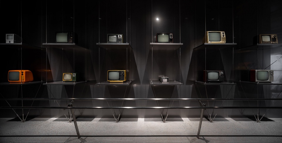
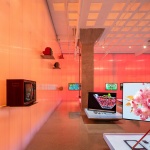
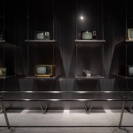
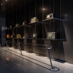
▼老电视展览墙,the Old TV exhibition wall © 蝈蝈
▼老电视展览墙,the Old TV exhibition wall © Wen Studio
此外,现代液晶电视的核心构成,是用一块“光谱屏”与一块“彩色屏”结合而成,光谱屏负责亮度,“彩色屏”负责饱和度。从光谱屏与彩色屏的分工组合上,也不难看出,“从模糊到清晰”的现代电视的构造:各司其职,越来越清晰的逻辑。
这是裸筑对室内空间的理解,追逐本质,用本质叙事。
In a modern LCD TV, there are two major parts playing significant roles – a spectrum screen responsible for brightness and a color screen for saturation. This separation has shown a trend towards increasing specialization and sophistication contributing to higher definition images.
As always, pursuing essence and expressing it to tell the story is how Roarc Renew interprets an interior space.
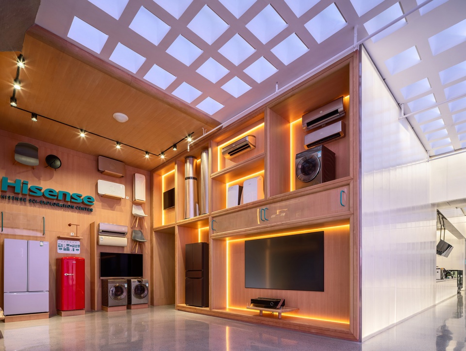
▼客厅展区,the living room exhibition area © Wen Studio
空间即像
Space as Images
我们把空间作为显示的载体,作为空间叙事的一种隐喻。我们想在空间里成两种像:
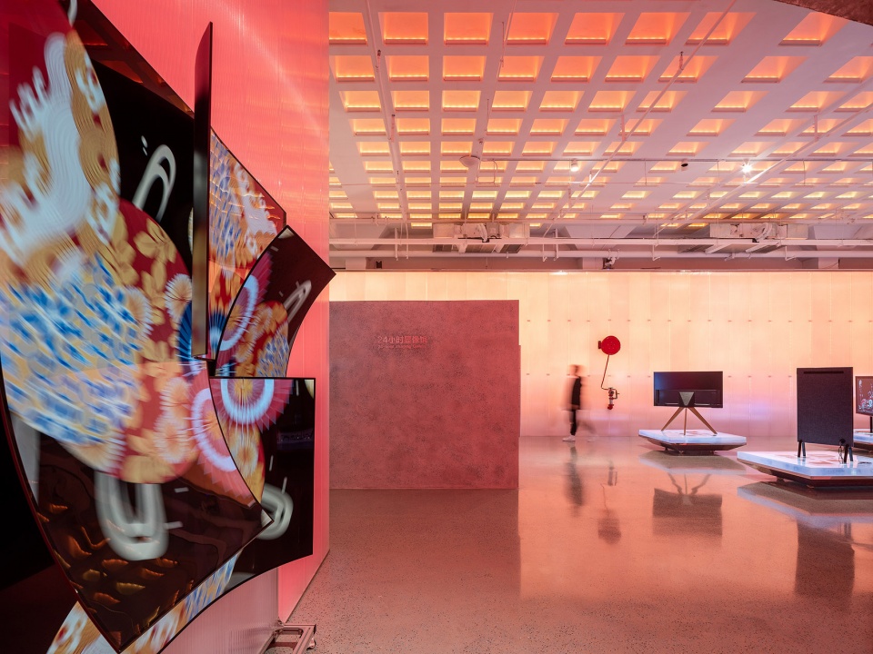
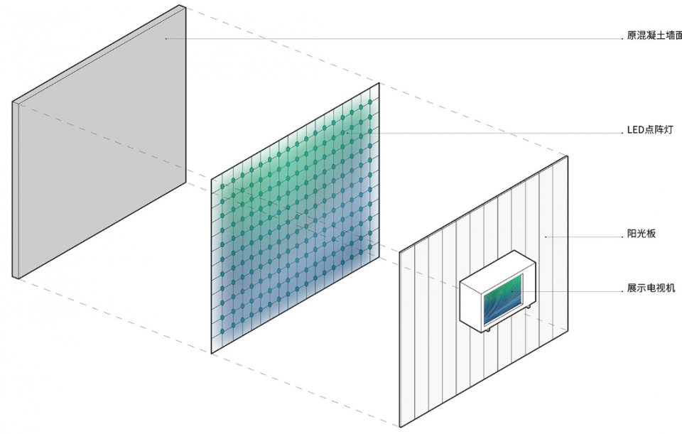
1 多色:从模糊到清晰的过程,即从墙面的模糊混沌的状态,到电视机液晶屏的清晰状态。我们邀请多媒体顾问,希望实现数字信号同频传导,即,电视机屏幕的图像与空间成像保持一致,由相同的图像的冲突,来表达从模糊到清晰这一本质特征。
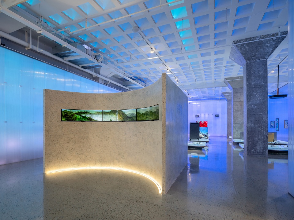
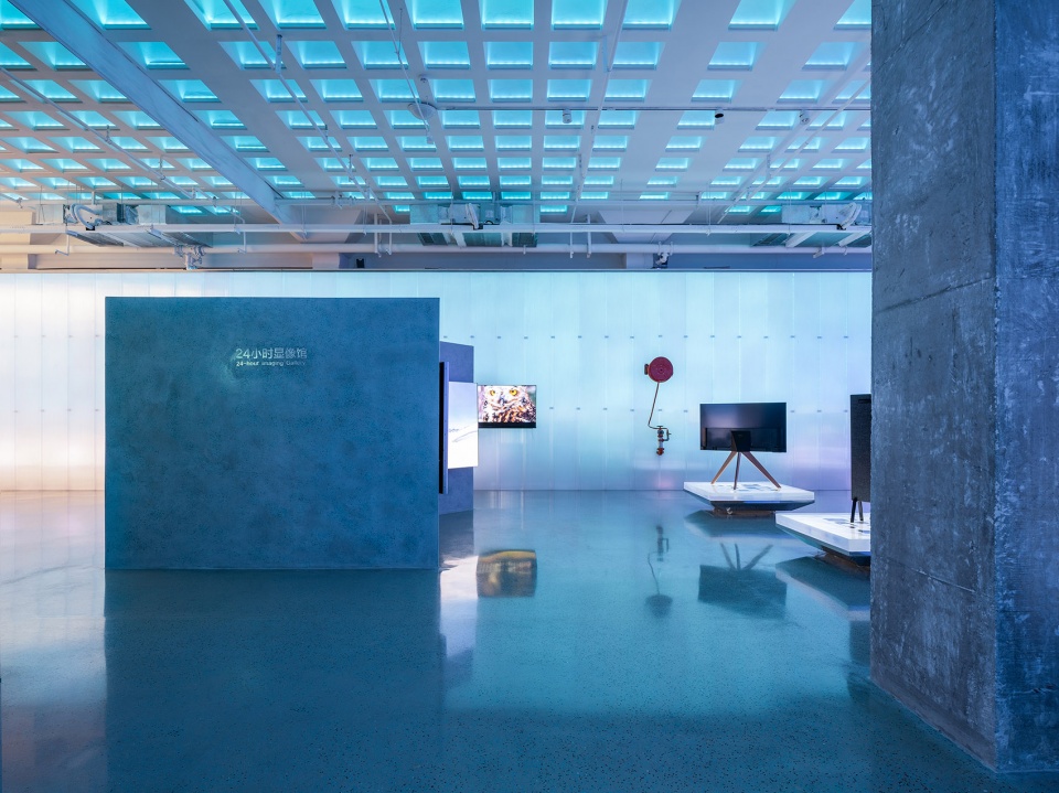
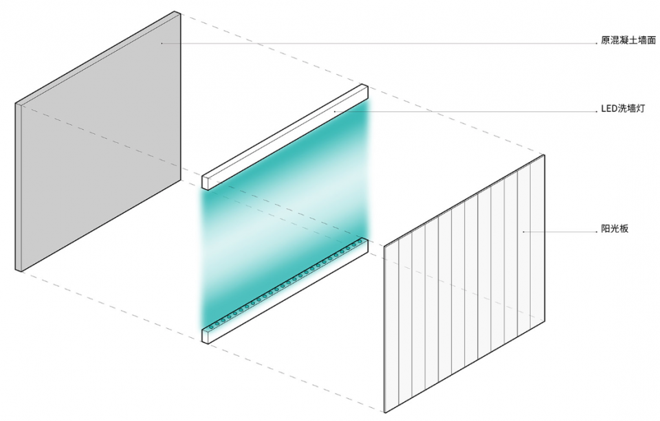
2 单色:所影射的是现代液晶电视中的核心“光谱屏”的本质特征,通过建筑材料阳光板的光过滤,将核心光谱屏的特征放大至整个空间尺度。
We use space as a way to show images and a metaphor to tell the story. We are intending to create two kinds of images in this space:
1. Polychrome: Recreating images from blurred to clear by showing a blurring wall morphing to a high definition LCD TV. To this goal, we have invited a multi-media consultant to help realize same frequency digital signal transmission. That means displaying different resolution versions of a same image to create the contrast and show the process of a blurred image to the high resolution one.
2. Monochrome: Reflecting the essential features of the spectrum screen, a key component in modern LCD TV. To this goal, PP sheets will be used as a light-filtering building material to magnify the features of the spectrum screen across the whole space.
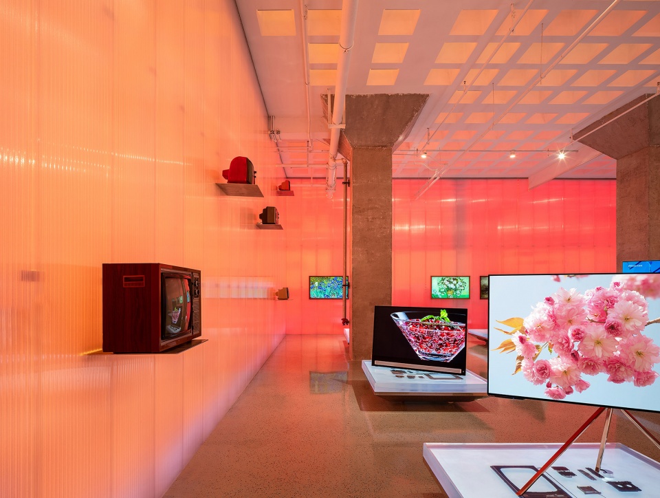
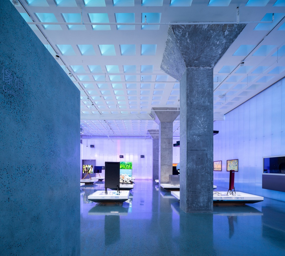
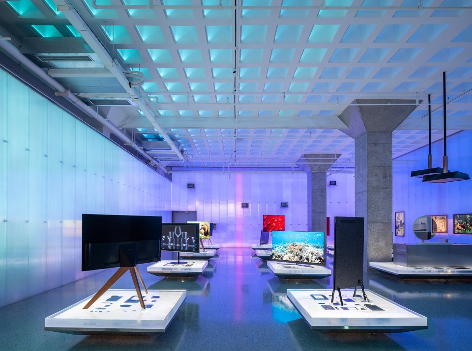
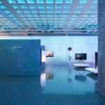
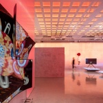
▼显示屏核心光谱的特征被放大至整个空间尺度,features of the display’s core spectrum are amplified to the entire spatial scale © Wen Studio
空间营造本是一种观点营造,而这样的观点,是可以被赋予商业价值与意义的。
To create a certain space is essentially to present a unique idea. Such ideas can be incorporated with business values and meanings.
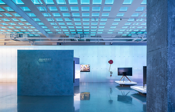
▼24小时显像管,24-hour imaging gallery © Wen Studio
混沌的秩序性
To Find Order in Chaos
裸筑曾提出过:美来源于秩序中的惊鸿一瞥。这是人的眼睛与脑在经历了教育之后所作出的共识与判断,这是一种多数人的审美价值取向,有技巧,也具有共识。我们几乎在之前所有项目中都实践了这个方法论。礼和拱券的纪律,有光旋转到最后的眼,泰合玺红砖的构造秩序……都成为了“出品”的保障。但凡形成了方法论,我们就希望能够找到其对立面,尝试,反复,从而往前走一步地创新。
在这个项目里,我们希望通过电子的无序来抵抗物理的有序,某种层面上来说,这也是对过去电视机的工业设计的“造形”,与现在液晶电视的“无形”的共鸣。
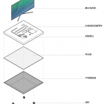
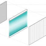
▼阳光板“光过滤”效果分析图,
analysis chart of “light filtering” effect of sunshine board © 裸筑更新
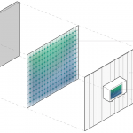
▼24小时显像馆墙面效果分析图,
analysis chart of the wall effect of 24-hour display gallery © 裸筑更新
Roarc Renew once put forward its approach of aesthetics: we believe that beauty imprinted on memory is a glimpse of the order in things. It is the consensus and judgement made by educated eyes and brains, a very tricky but quite common aesthetic value followed by most people. This approach has been applied in almost all our prior projects, whether it’s the disciplines in Carlowitz & Co’s arch ring, the eye up in MIXPACE’s spiral staircase or the orderly structure of TaiOursea Laomendong’s bricks. These orderly designs have become a mark of our products. However, established approaches won’t stop us from trying the contrary and stepping further to innovate.
In this project, we hope to use the disorder in digital world to resist the order in physical world. It is somewhat like a reflection for the industrial designs of the obsolete TV and the modern LCD TV.
▼阳光板呈现出混沌与无序,呼吸,心跳,共鸣,
the sun panel presents chaos and disorder, breathing, heartbeat, resonance © Wen Studio
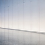
光透过5mm阳光板呈现出一种混沌与无序,呼吸,心跳,共鸣。希望这种人为尝试,将空间带往“好”的一面,让空间活着,像人一样,微弱地活着,不显,也不掩。
A scene of chaos and disorder is created when the light going through the 5mm PP sheets, wherein you can feel the breath, heartbeat and certain common feelings aroused. We hope such deliberate efforts could transform the space to a “better” existence, to live like a human, a trivial being not trying to show or conceal anything.
▼阳光板呈现出混沌与无序,呼吸,心跳,共鸣,
the sun panel presents chaos and disorder, breathing, heartbeat, resonance © Wen Studio
树脂展台
Resin Exhibition Stand
作为电视机大厂,海信的仓库里,有30台已被废弃的老电视。他们有一个共同的特点:外壳已经破碎不堪,内芯也尘封已久。
Hisense is a major TV manufacturer in China, we didn’t take much trouble to find 30 obsolete old TV sets in its repository. They all have one common characteristic: casings are all broken and kernels covered with dust.
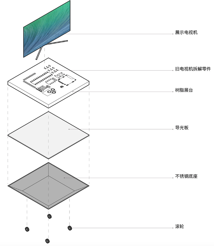
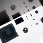
▼树脂展台构成分析图,resin booth structure analysis diagram © 裸筑更新
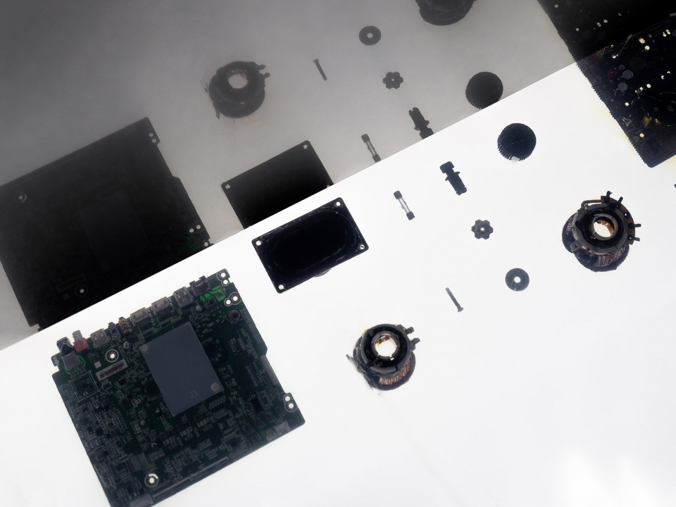
每个时代,都有每个时代的印记和特征,而这些都是那个时代最最珍贵和本质的东西。作为后浪,别把他们拍死在海滩上吧,公平的世界会让命运轮回。因此,我们把每个零件,一五一十地拆了出来,清灰,冲净之后,一个个打包,奔赴广东惠州的一家树脂浇注厂,用新的审美构成将这些零件摆放展出。
Every generation has their unique footprints and imprints, forming the most essential treasures of a time. The younger generation needs to respect the history and heritage of the past as the cycle of life treat everyone equal. Therefore, we want to reveal a part of TV history to the youth. We toke out all parts of the TV set, swept the dust away, washed them clean and packaged them separately. And then sent them to a resin factory in Huizhou of Guangdong Province to be cast in resins, in a beautiful and peaceful arrangement based on new aesthetic values.
▼树脂展台细部,resin booth details © Wen Studio
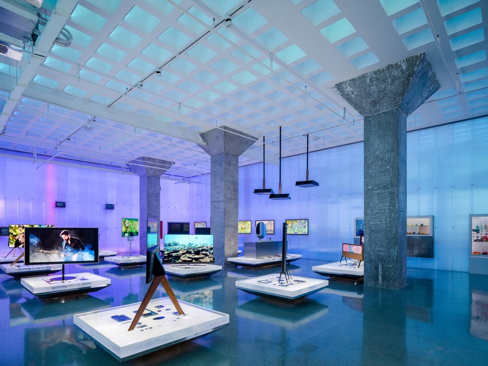
现在,这个项目的未来电视展厅是用这十二组老电视树脂展台支撑起来的。树脂自身的导光性,让在其内部的旧零件们,熠熠生辉。
And now, the 12 resin exhibition stands made up the exhibition hall. The almost transparent resin can let light fully filter through, making the internal parts all sparkly and shiny.
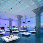
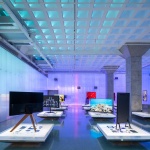
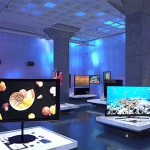
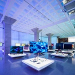
▼24小时显像馆由12组老电视树脂展台支撑起来,the 24-hour pavilion is supported by 12 sets of old TV resin stands © Wen Studio
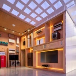
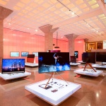
▼老旧零件树脂展台“支撑”起来的未来电视展厅,the future TV showroom “supported” by old parts resin booth © Wen Studio
空间本身的特征们
Inherent Space Features
1无梁楼板的方格,所形成的“秩序感”,本够精彩。
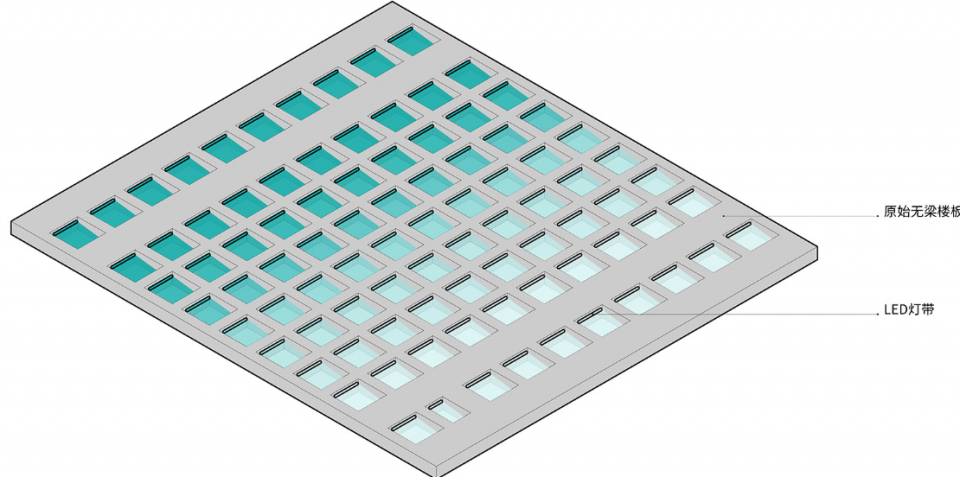
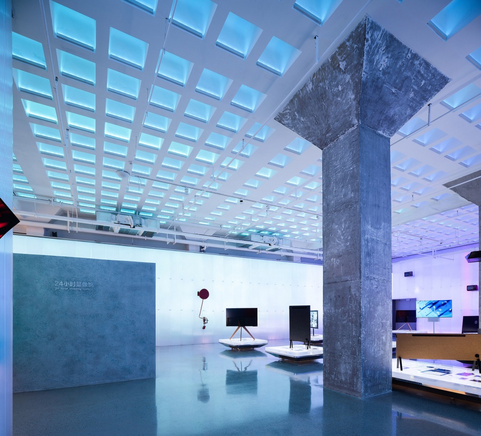
高级的设计,一定是顺水推舟,顺势而为。因此,每个方格被安置了一条变色灯带,打亮方格的空腔。值得一提的是,每一个空腔,被设计了一道背光线,是为了营造出空腔的空间感,整体顶部,呈一面秩序。每一处空腔的光,有一组弱电控制,与墙面的光谱,亮暗,混沌,一脉相承。
▼空腔构成分析图,analysis diagram of cavity composition © 裸筑更新
1. The grids formed by the girder-less floor have an inherent order, which is glamourous in itself.
A top design always makes the best use of the original structures and forms. With this logic in mind, each grid was set up with a color-changing light strip to illuminate the cavity in the grid. An additional backlight line was placed in each cavity to highlight the spatial pattern, while the whole ceiling presents a sense of order. Apart from this, the light in each cavity is controlled by a set of weak current to follow the changes in spectrum, brightness and definition of the wall.
▼天花空腔细部,ceiling cavity detail © Wen Studio
2伞形柱
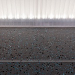
精致与混沌的空间中,夹杂了一份老建筑的记忆,也是对这些伞形柱的敬意。我们花了很大的力气,将混凝土本身的粗糙质感剥离,打磨。
2. Umbrella Columns
These old umbrella columns standing in this exquisite but chaotic space carries many old memories of the old architecture. To pay salute to it, we have spent lots of efforts to polish the concrete surface to take away some of the roughness.
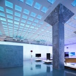
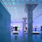
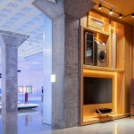
▼伞形柱,umbrella column © Wen Studio
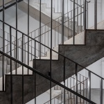
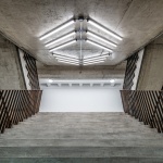
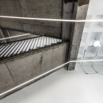
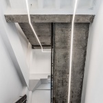
3消防楼梯
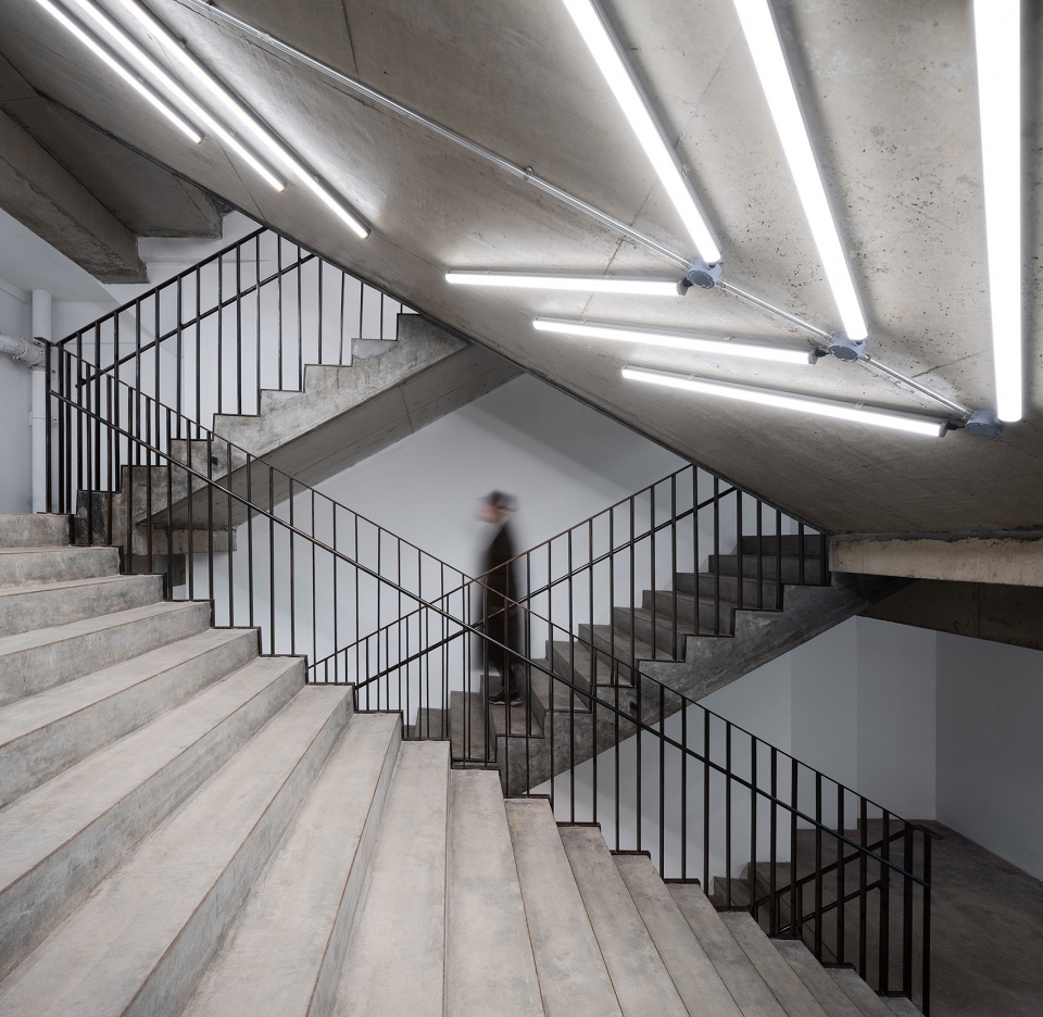
处理方式类似,营造出精致与粗糙的冲突,通过钢扶手的秩序,赋予空间的饱满性。灯的排布,指向,成为了在通道空间中,最为本质的存在。
3 Fire Stairs
Taking a similar approach, exquisite combines with roughness to create a certain contrast. The order of the steel rail has given the space a sense of fullness. The arrangement and direction of the lights demonstrated the most essential existence in the stair space.
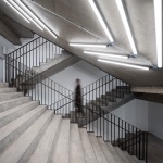
▼消防楼梯,fire stairs © Wen Studio
▼消防楼梯中的灯光指引,light guide in fire stairs © 蝈蝈
4 磨石粒
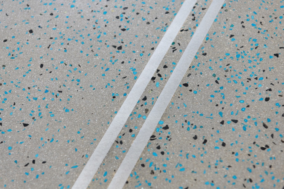
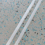
毕竟这是一个商业项目,商业本身的露出,是我们对业主的敬意。这个世界上,有一种绿色,叫做海信绿,这是海信人的骄傲,是青岛青的代表。我们寻找到一种骨料,与海信绿接近,通过磨石无数次冲刷而成型平坦,并透出一粒粒的海信绿。我们希望将隐喻的价值更多地展现在商业露出里,不显,也不掩。
4 Grinded Grains
Considering it’s a commercial project, we have a duty to show the commercial elements as a respectful gesture to the proprietor. There is a color called Hisense green, an iconic color which all Hisense people take pride in. We managed to find a kind of aggregate with a similar color to Hisense green. We hope the Hisense green to be exposed by the grains after millions of grinding between millstones. Thus, the commercial metaphor is shown in an implicit and natural way, rather than showing or concealing something deliberately.
▼海信绿定制水磨石细部,Hisense green custom terrazzo details © Wen Studio
最后,裸筑对于设计本质的追求,执着。也是我们对待每个项目的立场。空间营造是建筑的一层分支,我们希望通过逻辑,本质,意义,更多抽象思维来对待这个具象且直接的世界。
As always, Roarc Renew is dedicated to exploring the essence of architecture. This is also the way we dealt with every project we took. With the space creation being a branch in architectural design, we hope to use logic, essence, meaning and more abstract thinking to define this concrete and impulsive world.
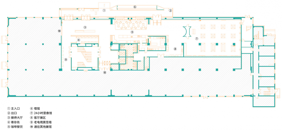
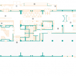
▼平面图,plan © 裸筑更新
项目名称:海信科学探索中心未来展厅
项目地点:中国青岛
项目地址: 山东省青岛市市南区江西路11号
建筑面积:1200平方米
设计单位:裸筑更新建筑设计事务所 roarc.cn
主持建筑师:柏振琦
项目建筑师:盛朦萱
设计团队:梁萧怡 顾倩 吴叶静 杨俊一
老电视机拆解+树脂亚克力岛台制作: 柏振琦 郁颖 盛朦萱 张成华
张海波 张小凡 梁萧怡 薛乐骞 陆慧沁 王丽 何银
灯光设计:降昭龙
多媒体顾问:上海赢赞数字科技有限公司
施工顾问:张成华 结庐装饰
施工方:上海结庐装饰设计工程有限公司
摄影师:Wen Studio, 蝈蝈
业主:海信集团有限公司
主要建材:水磨石 阳光板 和纹不锈钢
设计时间:2019. 03-2019.05
施工时间:2019. 07-2019.10
Project name: HISENSE SCIEN-EXPLORATION CENTER Future Exhibition Hall
Location: Qingdao, China
Address: No.11, Jiangxi Road, Shinan District, Qingdao City, Shandong province, China
Building area: 1200 square meters
Designer: Roarc Renew (roarc.cn)
Principal architect: Robben Bai
Principal architect: Sheng Mengxuan
Design team members: Liang Xiaoyi, Gu Qian, Wu Yejing, Yang Junyi
Old TV set disassembly+Resin acrylic island production: Robben Bai,Yu Ying, Sheng Mengxuan,
Zhang Chenghua, Zhang Haibo, Zhang Xiaofan, Liang Xiaoyi, Xue Leqian, Lu huiqin, Wang Li, He Yin
Lighting Design: Jiang Zhaolong
Multimedia consultant: BEBEETECH DIGITAL CO.LTD
Construction consultant: Zhang Chenghua from Shanghai Jielu Decoration Design Engineering Co., Ltd.
Constructor: Shanghai Jielu Decoration Design Engineering Co., Ltd.
Photo credits: Wen Studio, GuoGuo
Client: Hisense Co.,Ltd.
Main building materials: Custom terrazzo, Polycarbonate Sheet, Irregularly-lined stainless steel
Date of design (start and completed date): 2019. 03-2019.05
Date of construction (start and completed date): 2019. 07-2019.10
More:裸筑更新。更多关于:RoarcRenew on gooood
