非常感谢 加减智库 予gooood分享以下内容 。更多关于他们:PMT Partners on gooood
Appreciation towards PMT Partners for providing the following description:
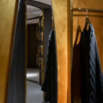
浙江义乌,除了是全国乃至全球闻名的小商品集散地之外,还是阿拉伯人与回民族群的聚居地。他们在此经商、落户、生活,很多阿拉伯人将之视为自己的第二故乡,将饮食、服饰文化引入这一座江浙腹地的商城,孕育出独特的城市文化与街头风景。
业主方”嘉米拉服饰”就是其中具有代表性的品牌之一——专注于设计、生产穆斯林头巾与服饰,立足于伊斯兰文化,为穆斯林女性创造多元化的装饰选择。因此,业主方希望作为品牌的旗舰店,嘉米拉伊斯兰服饰旗舰店的空间需要有信仰的暗喻与地方属性。
▼视频,video ©加减智库
Yiwu City in Zhejiang Province is not only the nation-wide and world-famous small commodity collection and distribution center, but also is inhabited by a great number of Arabians and the Hui people. They live and settle here for business, and many Arabians view it as their second hometown. They have brought with them their food and costume culture into this commercial city, a hinterland of Jiangsu and Zhejiang area, thus a unique urban culture and street sight is created here.
The proprietor JIAMILA Fashion is one of the representative brands, committed to the design and manufacture of turban and Muslim costume. Based on Islam culture, it creates diversified ornament choices for Muslim women. Therefore, the proprietor hopes that as the flagship store of the brand, the JIAMILA Islamic Fashion Flagship Store should entail religious belief implication and local features in the space.
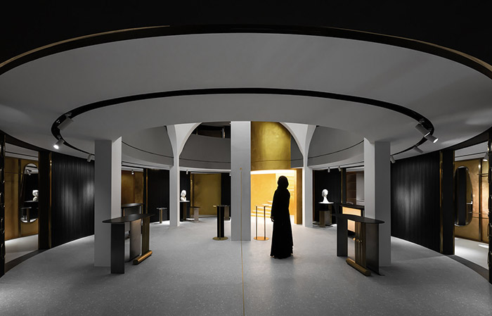
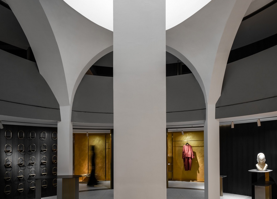
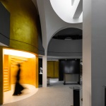
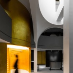
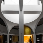
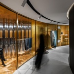
▼一层空间概览,1st floor overall view©曾喆
因而,借由Paulhans Peters在《Baumeister》刊载的 《Analogous Architecture: Radical Proposal for a Poetic Architecture》一文中 “对经典的陌生化”的观点——“陌生化并不是说抄袭或者依附某种风格,而更像是在[即兴创作],虽然已经是在含蓄地表达,但对经典里面蕴含的那种永恒的品质仍然可以被广泛地感知。”
对具有地域性与可塑造信仰暗示的经典建筑语汇进行转译,对一个在现实中本身就带有诗意与崇高的物质的模仿,同时还要对该现实进行“陌生化”处理,使其脱离外化形式的束缚。这是本次设计的内在逻辑。
Here we’d like to quote Paulhans Peters’ point of view “Alienation of the Classics” in his article Analogous Architecture: Radical Proposal for a Poetic Architecture published in Baumeister: “Alienation does not mean imitation or adherence of a certain style. It is more of an improvisation. Even though it is implicitly expressed, the eternal quintessence in the classical can still be universally perceived.”
The internal logic of the design is to translate the classical architectural vocabulary with regionalism and religious belief implications, to imitate a poetic and sublime substance in reality, and to defamiliarize this reality so that it can break away from the bound of external form.
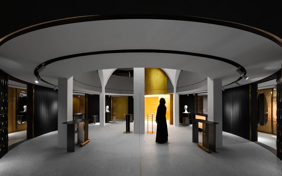
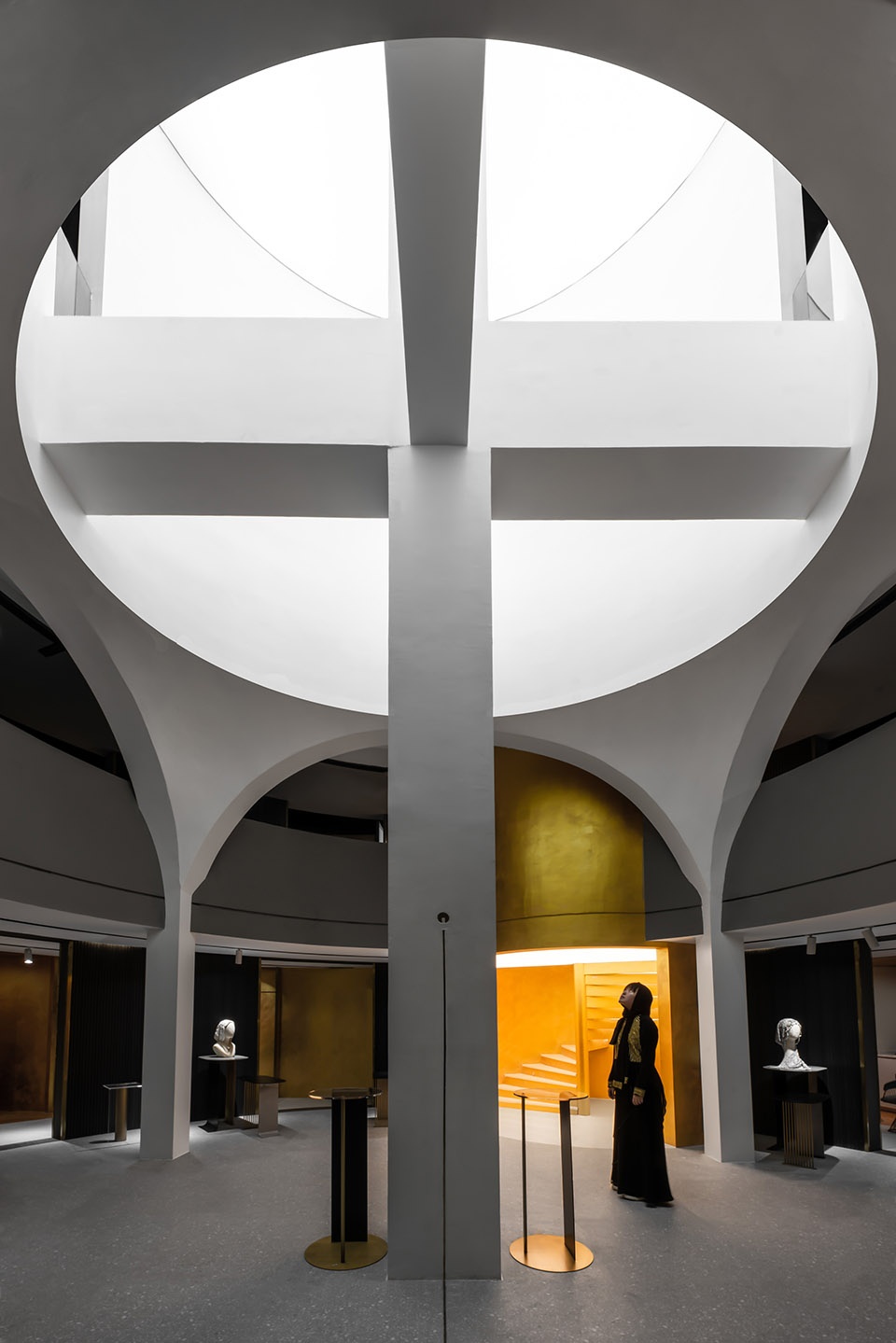
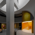
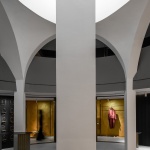
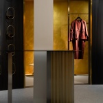
▼一层中庭核心展示空间,the core display space of the 1st floor ©曾喆
而如何将强烈的品牌性格转化成空间属性,使其具备市场独特性与形象不可复制性;如何利用空间的仪式感召示吸引顾客,使其成为可广为流传的形象输出;如何通过空间的层层递进导流,打破底层商铺面积受限,使业态向二三层顺利扩展,则是本次设计面临的三个主要回应商业空间基本属性(推广、引流、使用)的策略。
There are three major strategies in the design to fulfill the basic features of the commercial space: the first is to transform the intense brand characteristics into spatial features to empower it with unique market superiority and an image which is not possible to copy; the second is to attract customers by creating a special ambient with the space going viral; and the third is to draw pedestrians step by step, to break up the area limitation on the ground floor and to further develop businesses on 2nd and 3rd floor.
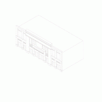
▼设计示意图,diagram ©加减智库
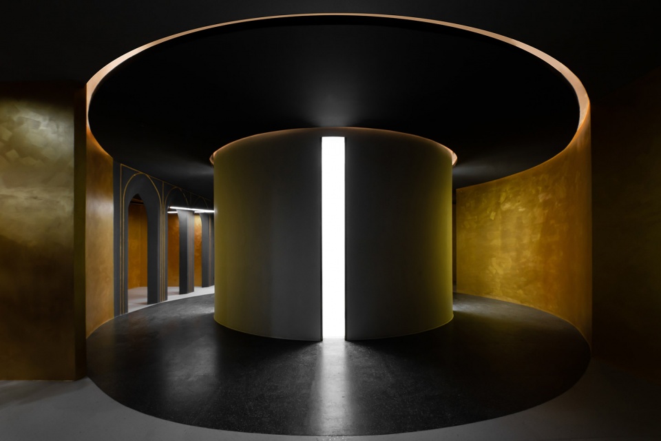
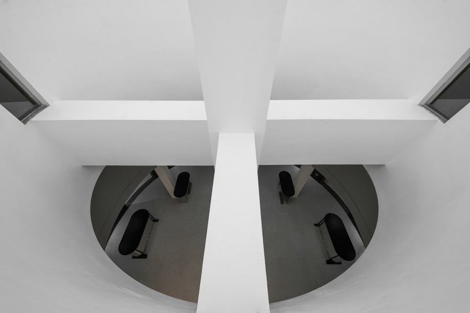
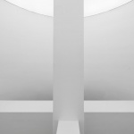
会所空间位于义乌市中心的万达广场内,由4个3.1m*12.5m的沿街商铺组合而成,内部通高,高度为9.5m。在拆除分户墙后,空间的中心位置只留有一根结构立柱与相应的十字梁,这为设计脱离纯装饰层面,塑造空间关系提供了自由度与依据。
为满足业主方不少于400㎡实际使用的要求,竖向空间被划分为3层,并围绕着结构柱与十字梁的对称关系形成两层通高的中庭。通过中庭的的视觉渗透与引导,打破二三层商铺空间无法引流的矛盾,使原有100多平方米的底层商业得以向上扩容。
The boutique is located in the Wanda Plaza in central Yiwu City, where there are four 3.1m*12.5m shop lining along the street. The internal height is all 9.5m. When the partition walls are demolished, there is only one structural column and the corresponding crossbeam in the central position. It provides freedom and basis for the design to break away from the pure ornament so as to achieve spatially shape.
To fulfill the requirement with no less than 400m² display area by the proprietor, the space is partitioned into three floors vertically, and is built with a two-floor atrium of equal height around the symmetry created by the structural column and crossbeam. By virtue of the visual effect and guidance of the atrium, the dilemma of little stream of customers on 2nd and 3rd floors are solved and the ground floor business of over 100m² can also be expanded upward.
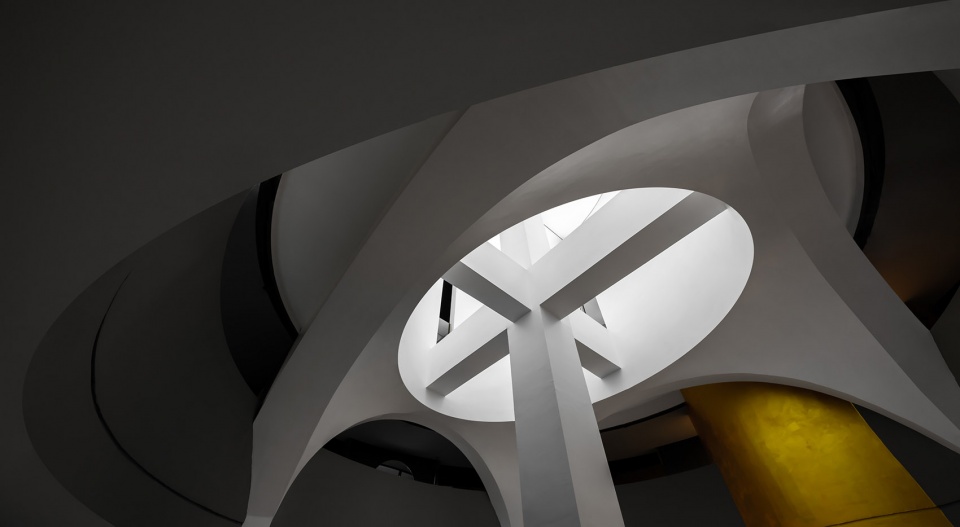
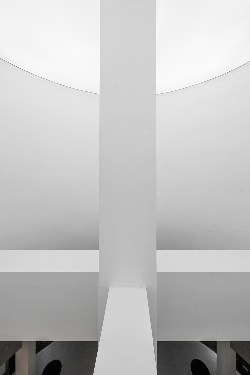
▼结构柱与十字梁,the structural column and crossbeam ©曾喆
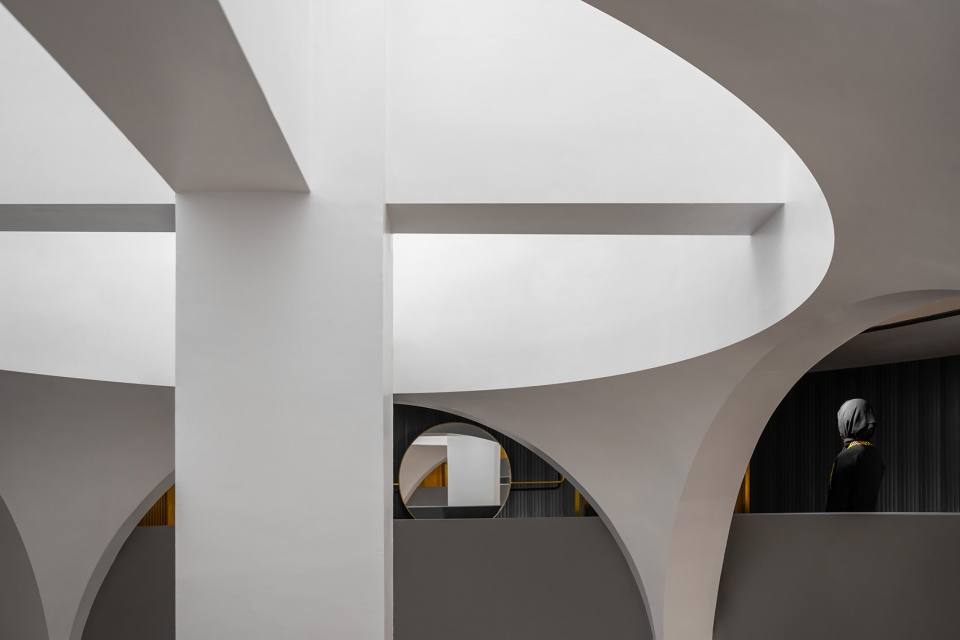
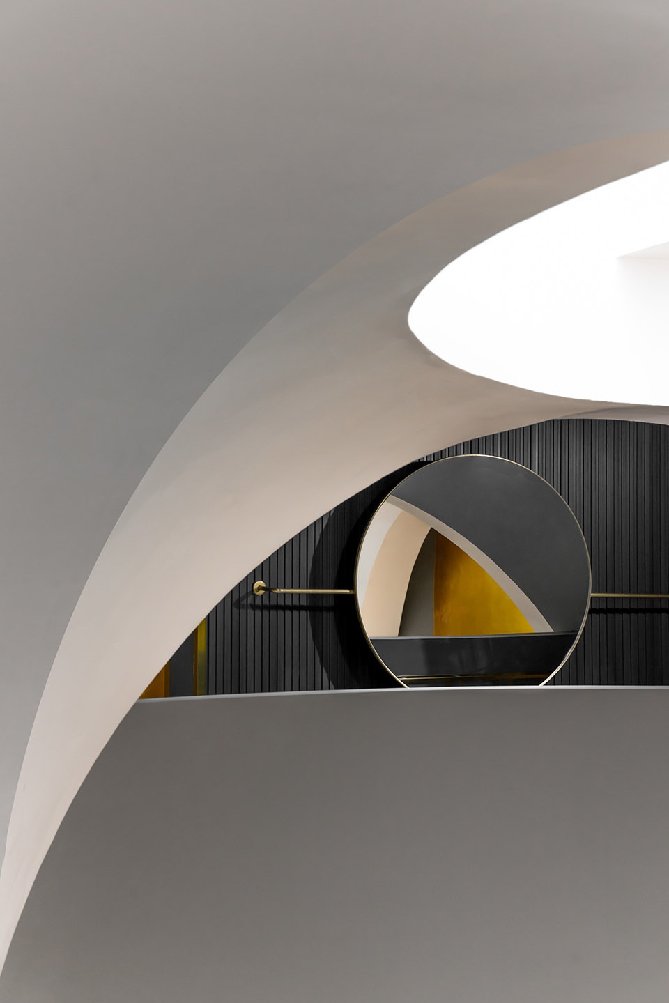
回应“对经典的陌生化”与地域性,中庭嵌入了一个由拜占庭传统建筑语汇“帆拱”形成的结构体系,它不仅为新增楼板提供支撑,更与其上方的筒状结构形成一套完整的空间关系。这为实现仪式感与信仰的暗示提供了可能,而这样的空间属性又符合网络图像流传的一般规律,使店铺形象获得自媒体大量曝光。
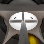
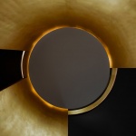
中庭帆拱与原结构十字梁柱,利用空间的仪式感昭示吸引顾客,使其成为可广为流传的形象输出。帆拱是方形平面上做圆穹顶的一种过渡构件,在纪念性建筑上的首次使用,是6世纪中期的圣索菲亚教堂,为拜占庭建筑中主要的结构形式。而这种结构样式的地域性与所呈现的崇高感被“嫁接”于设计中,并被陌生化为一个由同心圆与椭圆组成的中庭空间,帆拱原应支撑而起的穹顶被置换成带有人工光的筒状结构,倾泻而下的光线亦如殿堂中的神圣的光辉。
To highlight the regionalism in “Alienation of the Classics”, we inlay a pendentive structure in the Byzantium traditional architectural vocabulary into the atrium, which will not only support the newly-added partition boards, but also form a holistic spatial system with the above cylindrical structure. It provides possibility for the creation of a special ambient and religious belief implications. Moreover, such spatial features comply with the rules of image trending on the internet, so the shop image will definitely go viral among We-Media.
The pendentive in the atrium and the crossbeam in the original structure will attract customers by a sense of spatial ceremony. Thus, it will become a popular and widespread image. Pendentive is a transitional architectural component to make a dome on a square-shaped plane. The first use of it in a commemorative architecture is the Church of Hagia Sophia in the mid-6th century. It is also a major structural form in Byzantine architecture. The regionalism and the sublimity in such a structural form is transplanted into the design and defamiliarized as an atrium composed by concentric circles and ovals. Meanwhile, the dome that is supposed to be supported by the pendentive is replaced by a cylindrical structure with artificial light, casting beams like the sacred radiance in the palace hall.
▼中庭帆拱与原结构十字梁柱 ©曾喆
the pendentive in the atrium and the crossbeam in the original structure
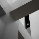
打破帆拱穹顶完整性的原有的十字梁柱,同时保留着原有建筑骨架的痕迹,是整个设计思路的起点,也是“经典被陌生化”的一个重要的切口:它弱化了固有帆拱穹顶的外化样貌,使设计摆脱对经典的完全模仿,又极大的增强经典里面蕴含的永恒的品质。
The original crossbeam that breaks up the integrity of the pendentive will maintain the original framework in the architecture. It is the start of the entire design and also an important entry point of “Alienation of the Classics”, because it weakens the appearance of the stereotyped dome with pendentive so that the design goes beyond a complete imitation of the classical and the eternal quintessence in the classical design is enlarged.
▼一层中庭展示空间与通过中庭可见的二层空间——空间的层层递进导流,打破底层商铺面积受限,使业态向二三层顺利扩展 ©曾喆
the showcase in the atrium on ground floor and the visible 2nd floor space through the atrium will lead the customers step by step so that the area limitation on ground floor is broken up and business can expand smoothly on 2nd and 3rd floors
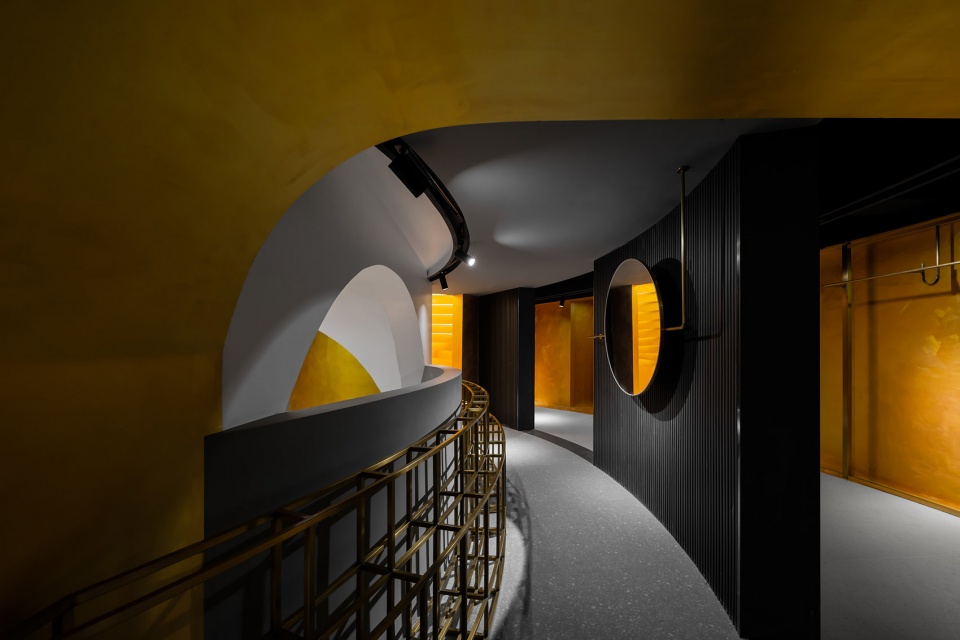
一层的服饰展示回廊被多个环绕中庭立柱的同心圆形成的弧形墙体、天花地花造型、道具挂架及灯带等所界定,形成回字形的浏览路线,并能通过向心发散布置的出入口与中庭连通。回型布局、向心与发散,不仅最大限度使四周墙面作为展示之用,更能紧密的围绕具有仪式感的中庭空间。
The ambulatory showcase for costume exhibition on ground floor is delimited by several arc-shaped walls, ceilings, floors, hangers and hidden track lighting which are formed by concentric circles around the central column in the atrium. It creates an ambulatory shopping route with several radial entries and exits connected to the atrium. The ambulatory layout and radiant design will give full play to the surrounding walls for exhibition, and also create a more compact and ceremonious atrium space.
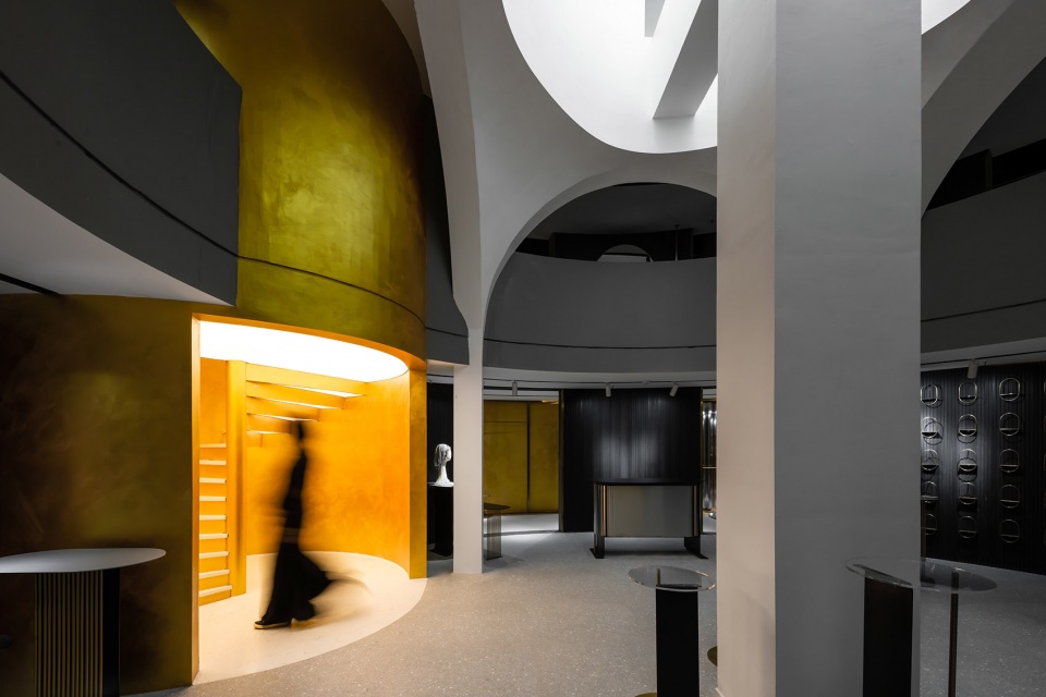
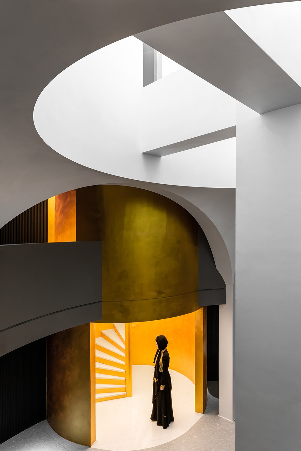
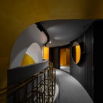
▼螺旋楼梯筒与中庭穹顶,spiral staircase and atrium dome ©曾喆
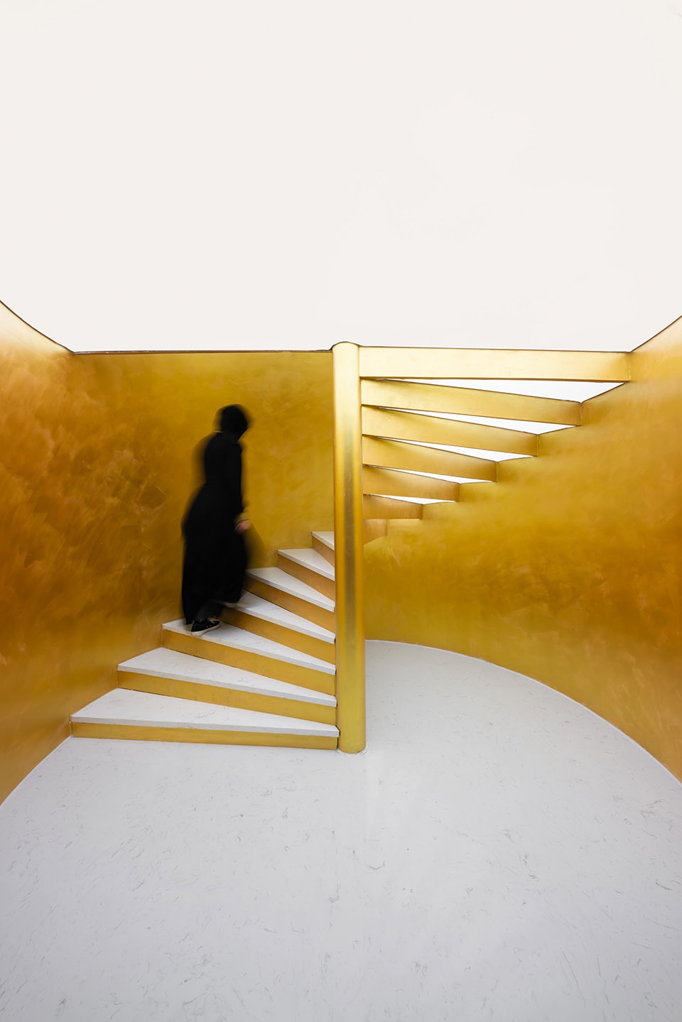
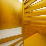
▼螺旋楼梯筒内,inside the spiral staircase ©曾喆
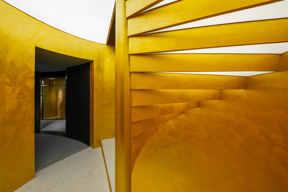
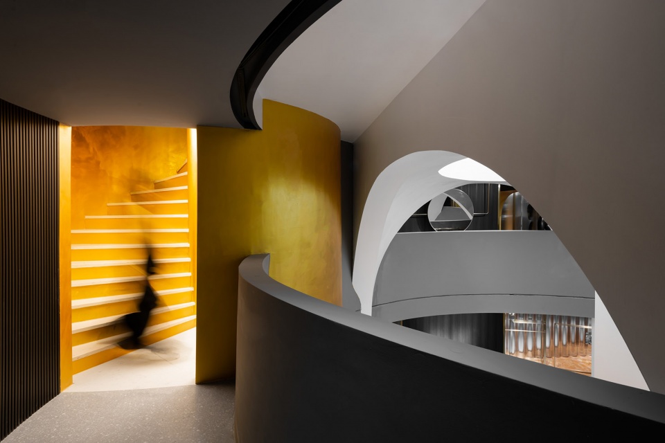
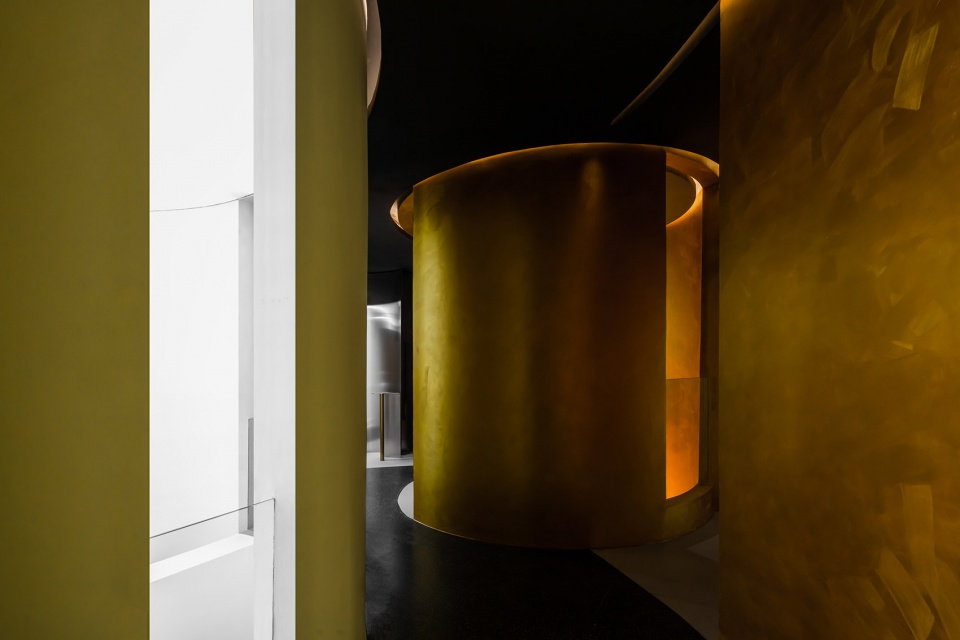
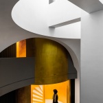
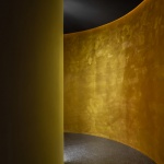
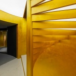
螺旋楼梯被包裹在一个圆筒体量之内,贯穿联系起三层空间,布置于以中心立柱为轴线的一侧,跳脱的颜色与体量感,使楼梯成为二三层引流顾客的关键点。而其偏心的布局方式打破各个方向都均衡对称的整体布局状态,消解对于经典对称关系的纯粹模仿,达成“陌生化”的暗示。
Positioned at one side of the central column axis, the spiral staircase is enclosed in a cylinder to connect space on all three floors. With vivid colors and tremendous size, it will become a key to attract customers to 2nd and 3rd floors. By virtue of the eccentric layout, the staircase will break the equilibrium and symmetry in the overall design. It decomposes the pure imitation of classical symmetry and implies the “alienation”.
▼螺旋楼梯细节,detailed views ©曾喆
螺旋楼梯筒内,台阶底部被安放均匀的灯模,使整个楼梯筒向外溢出光线,达到最大化的昭示,吸引顾客向上行走。同时,借由此光源,与穹顶光照一并,形成几层空间的主光源,意在以节制的光感塑造除布局、空间以外,第三个层次的“陌生化”。
Inside the spiral staircase, well-proportioned lighting features are installed under the steps so the entire staircase will emit rays of light outward to highlight and attract customers to walk up. In addition, this light source and the beams from the dome will form a major light source for the three floors. The design aims to create a sense of “alienation” on the third level with moderate visual effect apart from the layout and space.
▼二层帆拱中庭,atrium with pendentive on the 2nd floor ©曾喆
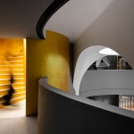
厚重的帆拱被外置的圈廊包裹,使本在一层被笼罩的观者能反观其背面(一个经典中不存在的背面),由其洞窟般的呈现,引发窥探一层中庭的欲望。
The heavy pendentive is enveloped by the winding corridor so the customers on ground floor covered by the pendentive are able to see the back of it (a back side that does not exist in classics). The cave-like appearance will arouse the desire of customers on ground floor to see what it is like in the atrium.
▼透过“洞窟”窥探的中庭局部,peek at part of the atrium through the “cave” ©曾喆
▼帆拱细节,details
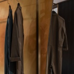
对应一层回廊展示空间,二层同样以同心圆的方式展开各个层次的布置。靠墙的高挂架与栏杆一侧的矮挂架结合,对头巾与服饰做出分区展示。
In correspondence to the showcase on ground floor, the layout on 2nd floor is also made by the form of concentric circles. High hangers are placed against the wall while short hangers against the handrails to partition turban and costume exhibition areas.
▼二层回廊展示空间,ambulatory showcase on 2nd floor ©曾喆
椭圆筒结构由贯穿一二层的帆拱体系支承,这个被“掏空”的筒,不仅为底层空间的延续与光照提供舒展的余地,更构成三层的空间骨架:圆筒表面作为展示墙,结合回廊为VIP客户展示最新产品;儿童活动房、VIP休息区、会议区、办公区等则环绕其布局。
The oval cylindrical structure is supported by the pendentive across ground floor and 1st floor. The hollow cylinder not only extends the space and reinforces the lighting for ground floor, but also constitutes the spatial framework of the 2nd floor. The surface of the cylinder will serve as the exhibition wall to display the latest products to VIP customers along with the corridor, surrounded by children activity room, VIP lounge, conference area and office area.
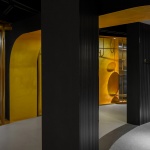
▼三层回廊展示空间,ambulatory showcase on 3rd floor ©曾喆
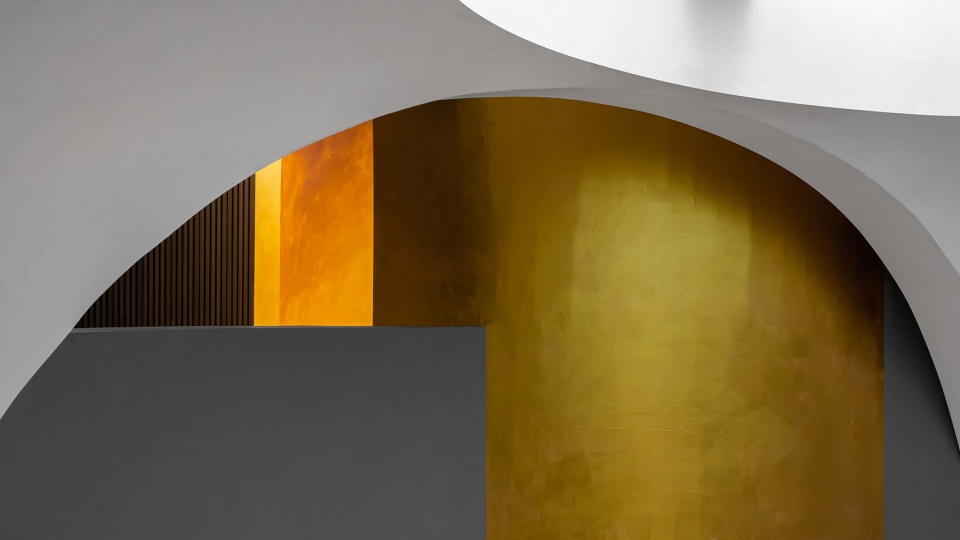
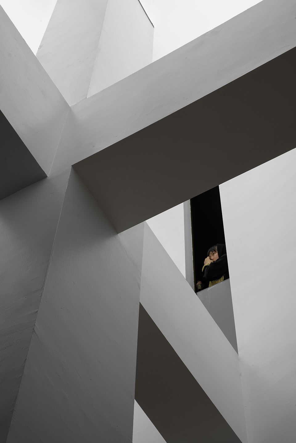
从一层开阔的,被笼罩的穹顶底部;到二层视线被“洞窟”所限制;直至三层空间,只可在缝隙中一探究竟,观者在行进之中不断递进的是对经典的陌生化过程,却又是熟悉的,能一如既往被感知的,经典之中不可言说的特质。
Covered by the dome, the ground floor has a broad view; the view on the 1st floor is confined by the “cave”; and only when the customers arrive at the 2nd floor can they peek through the crevices to see what exactly it is like. The customers will get defamiliarized with the classical design step by step, but somehow still feel familiar at the same time. They will perceive the self-evident characteristics in classical design.
▼三层螺旋楼梯口与回廊衔接处,spiral staircase on 3rd floor ©曾喆
▼螺旋楼梯筒三层顶部,ceiling of spiral staircase on 3rd floor ©曾喆
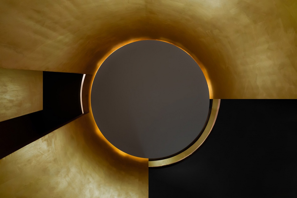
▼透过圆筒上的四条细缝,可回看底层的中心立柱与十字梁 ©曾喆
the central column and crossbeam on ground floor can be seen through the four slim crevices on the cylinder
▼在一楼中庭窥探三楼回廊缝隙,spiral staircase on 3rd floor
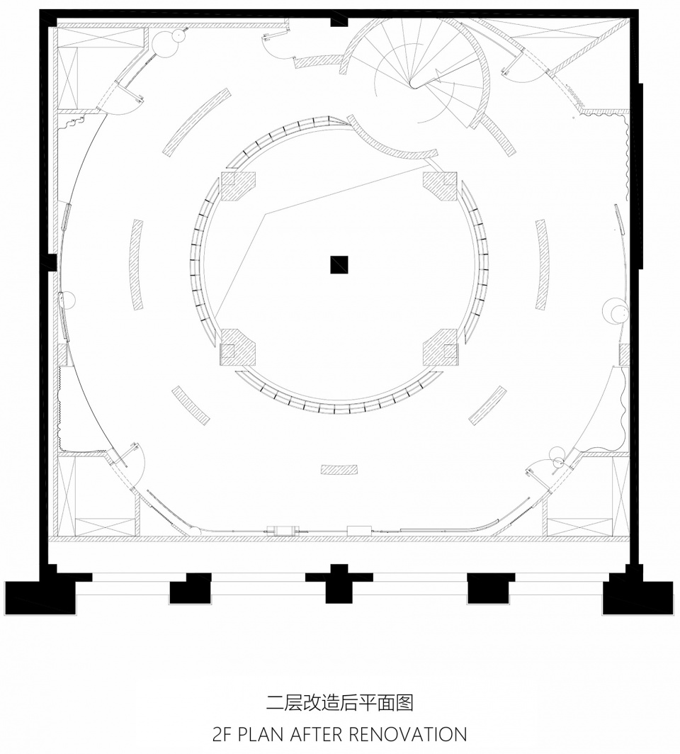
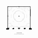
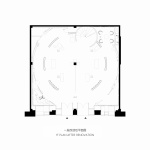
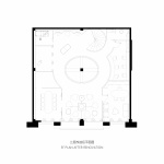
▼一至三层平面图,1F-3F plans ©加减智库
项目名称:嘉米拉伊斯兰服饰旗舰店
设计公司:加减智库设计事务所
公司网站:www.pmt-partners.com
联系邮箱:pmtpartners@163.com
主持建筑师:赵炜昊,曾喆,胡彦
设计团队:秦冕、卢泽强、周紫月、林冕仕
摄影:曾喆
业主单位:嘉米拉(香港)有限公司
建筑面积:430 m2
建成时间:2019
项目地址:浙江义乌市吾悦广场
Project Information
Project Name: JIAMILA Islamic Fashion Boutique
Deisgn Firm: PMT Partners Co., Ltd.
Website:www.pmt-partners.com
Contact E-mail:pmtpartners@163.com
Principal Architects: ZHAO Weihao , ZENG zhe, HU yan
Design Team: QIN Mian, LU Zeqiang, ZHOU Ziyue, LIN Mianshi
Photographs: ZENG zhe
Client: JIAMILA (HK) Fashion Co., Ltd.
Building Area: 430 m2
Completion Year: 2019
Project Address: Wuyue Plazza, Yiwu City, Zhejiang Province, China
More:加减智库。更多关于他们:PMT Partners on gooood
