非常感谢 Alvisi Kirimoto 予gooood分享以下内容。更多关于他们请至:Alvisi Kirimoto on gooood 。
Appreciation towards Alvisi Kirimoto for providing the following description:
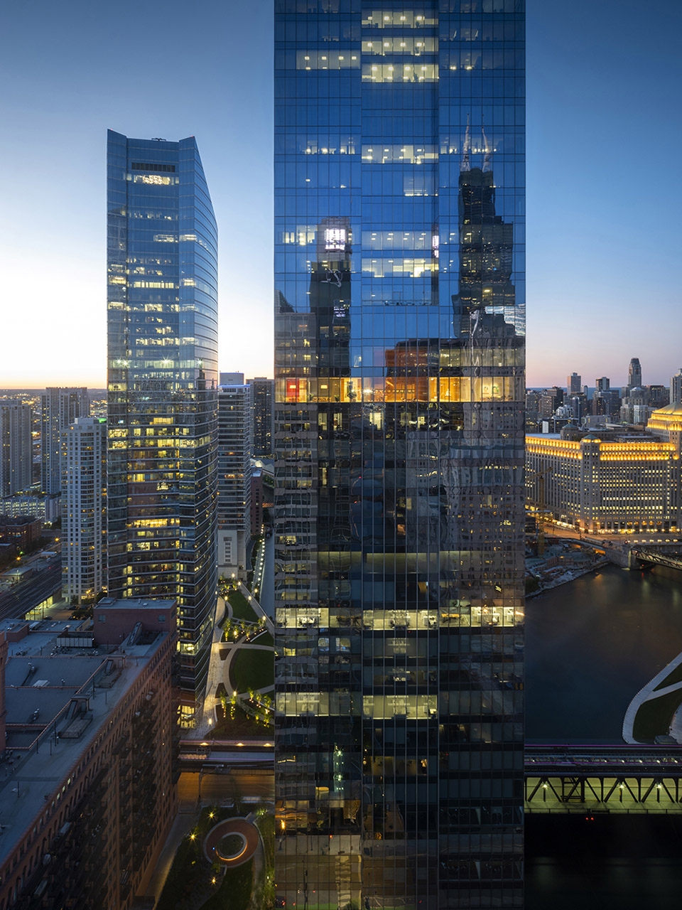
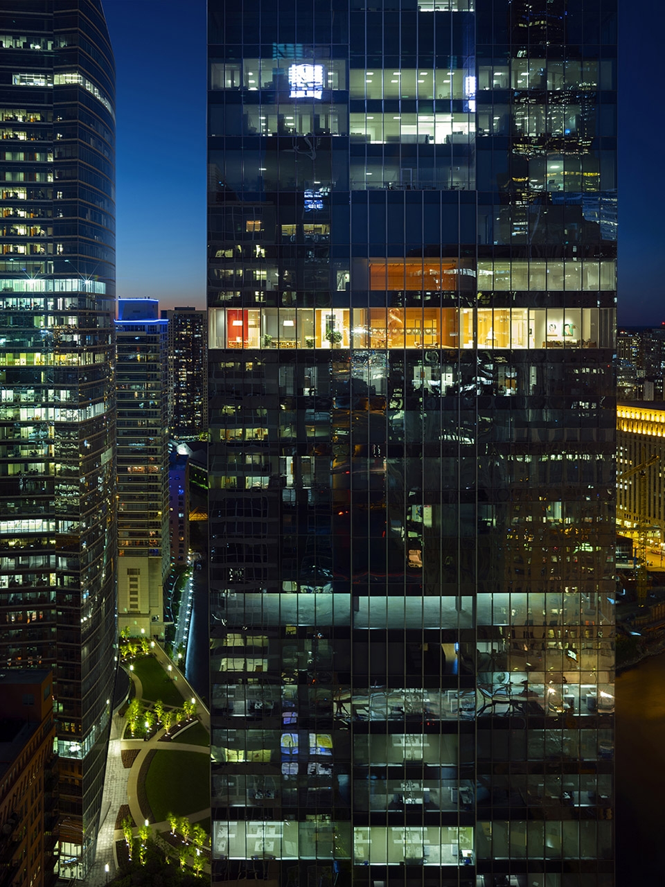
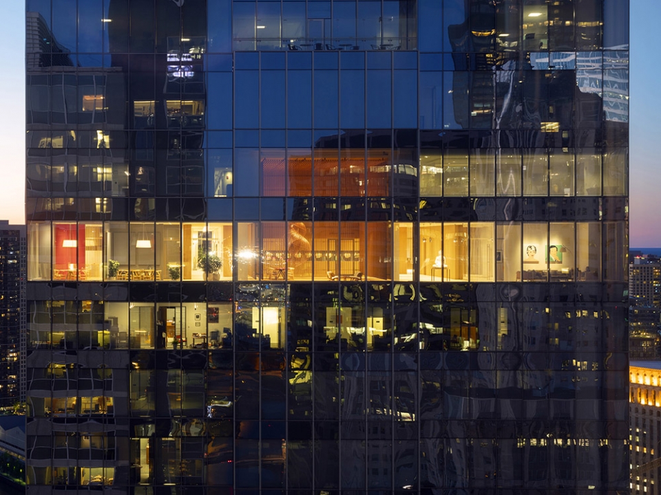
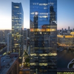
罗马建筑设计公司Alvisi Kirimoto设计的行政办公室位于芝加哥West Loop城市中心,在河流岸边一栋224米高的新建摩天楼的32层,面积为2600平方米,它耸立于云层之间,牢牢扎根于自身环境之中。项目设计目的是容纳客户的总部和展示其部分艺术收藏。
Suspended between the clouds, but firmly rooted in their surroundings, the executive offices designed by Rome-based architectural firm Alvisi Kirimoto occupy the entire 32nd floor of a newly built skyscraper in the lively ex-industrial district of West Loop, Chicago. The project, designed to accommodate the client’s headquarters and showcase part of his art collection, fills an area of 2,600 sq. m, within a 224-meter high building located in the heart of the city, on the bank of the homonymous river.
▼办公室占据了芝加哥一座新建摩天大楼的32层空间,the offices occupy the entire 32nd floor of a newly built skyscraper in Chicago ©Nic Lehoux
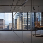
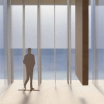
建筑师Massimo Alvisi与 Junko Kirimoto这样描述这个空间体验:“一走出电梯抵达32层,你感觉仿佛自己又沉浸于城市环境之中了——虽然是位于不同的高度和视角,却像是好好地站在芝加哥街道上。我们在墙壁、光线和视觉轴线紧凑韵律的引导下,漫步于当代东方艺术或考古展品中,偶尔震惊于窗外强烈的色彩或高耸的大楼。事实上,我们的第一直觉是让转角保持自由,维持与城市的视觉交流。”
The architects Massimo Alvisi and Junko Kirimoto describe the experience of encountering the space, as follows: “The moment you leave the elevators, arriving on the 32nd floor, you feel as if you were immersing yourself again in the city – at a different height and perspective, of course, but with your feet well planted in the streets of Chicago. It is precisely the layout of the city with its surprises that we strive to project within this space: we stroll through pieces of contemporary and oriental art, or archeology, surprised occasionally by strong colors or the unusual double heights of a skyscraper, guided by the tight rhythm of the walls, the light and the visual axes. In fact, our first instinct was to leave the corners free to maintain constant eye contact with the city. ”
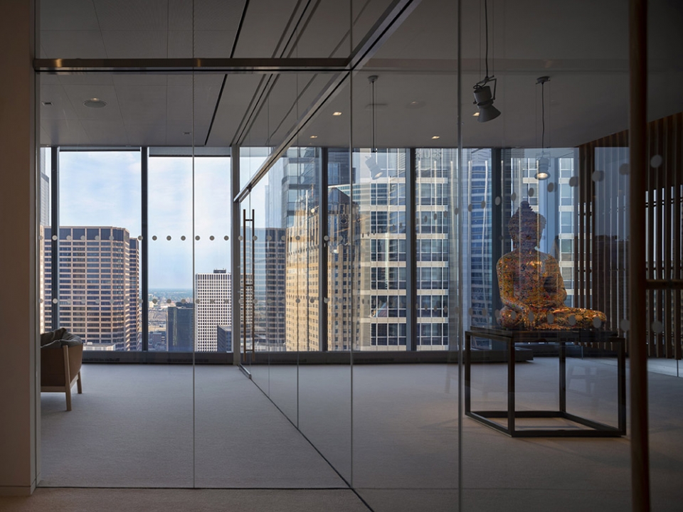
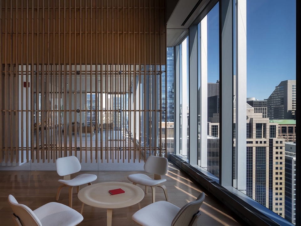
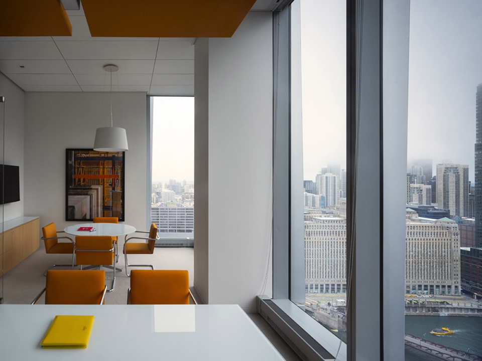
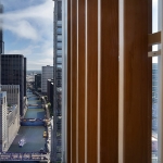
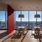
▼建筑与城市之间建立了良好的联系,connection between the office and the city ©Nic Lehoux
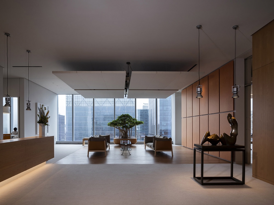
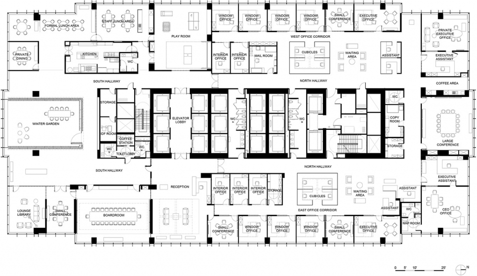
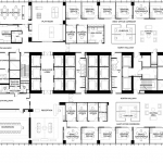
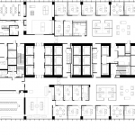
空间主入口位于建筑核心筒,这里也包括所有的服务和设施。入口空间一侧是接待区另一侧是游戏室,巨大的落地窗户让访客与芝加哥的两面建立联系:城市和风貌。从平面上看,北侧布置最具有代表性和综合性的功能区域,包括接待区、会议室、冬季花园、展览路线和餐厅区域,南侧是相对私密的办公室和一些公共区域。
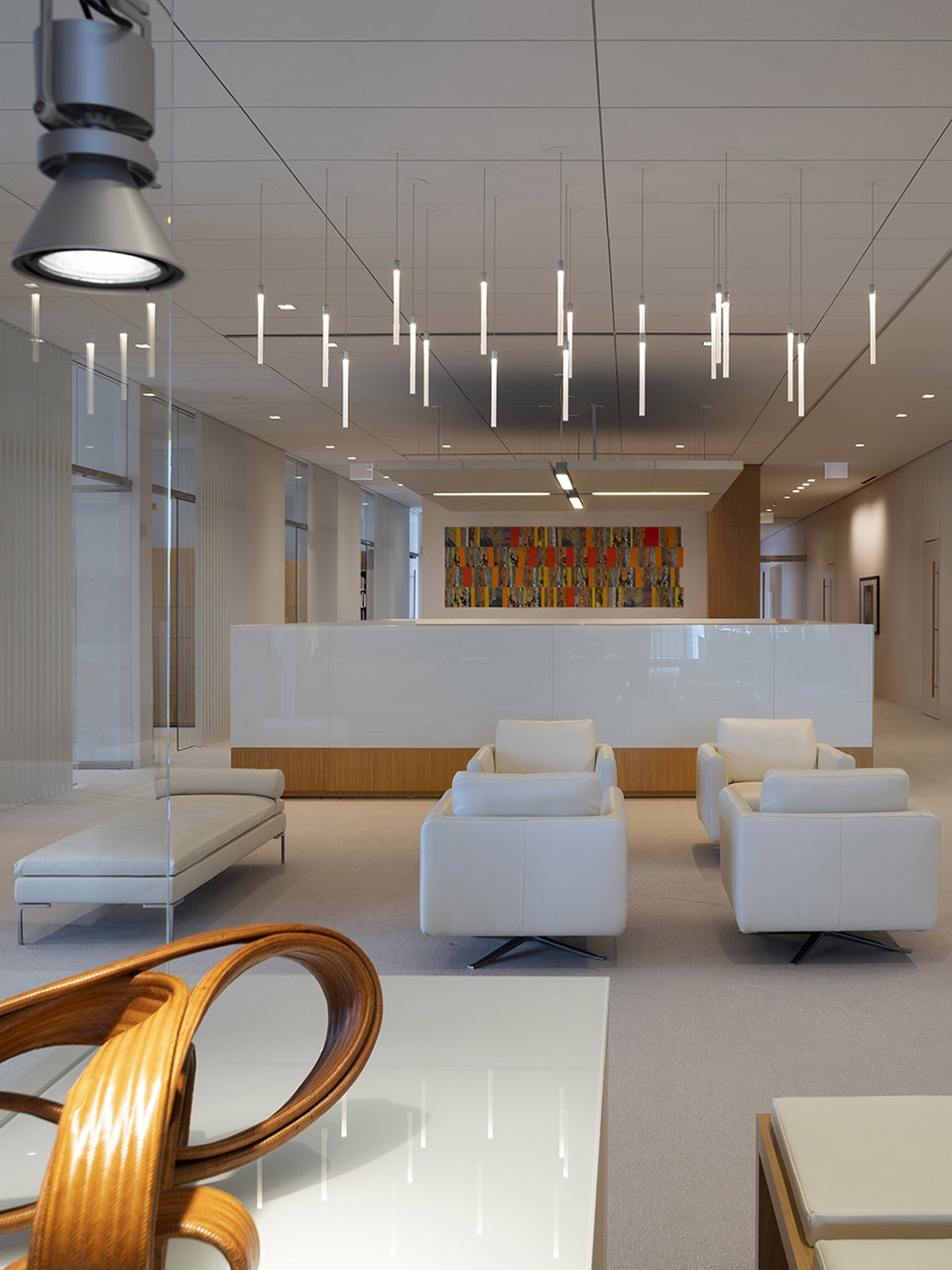
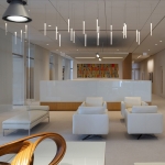
The main entrance to the building is located in its structural core, which encompasses all services and facilities. Two opposing rooms are immediately visible upon entry: on one side, the reception area and on the other, the playroom, both characterized by a large window that connects the visitor with the two faces of Chicago: the urban and the territorial. From a planimetric point of view, the North side hosts the most representative and aggregative functions such as the reception area, the meeting room, the Winter Garden, the exhibition routes and the restaurant area, while the South-facing side houses the private offices and some common areas.
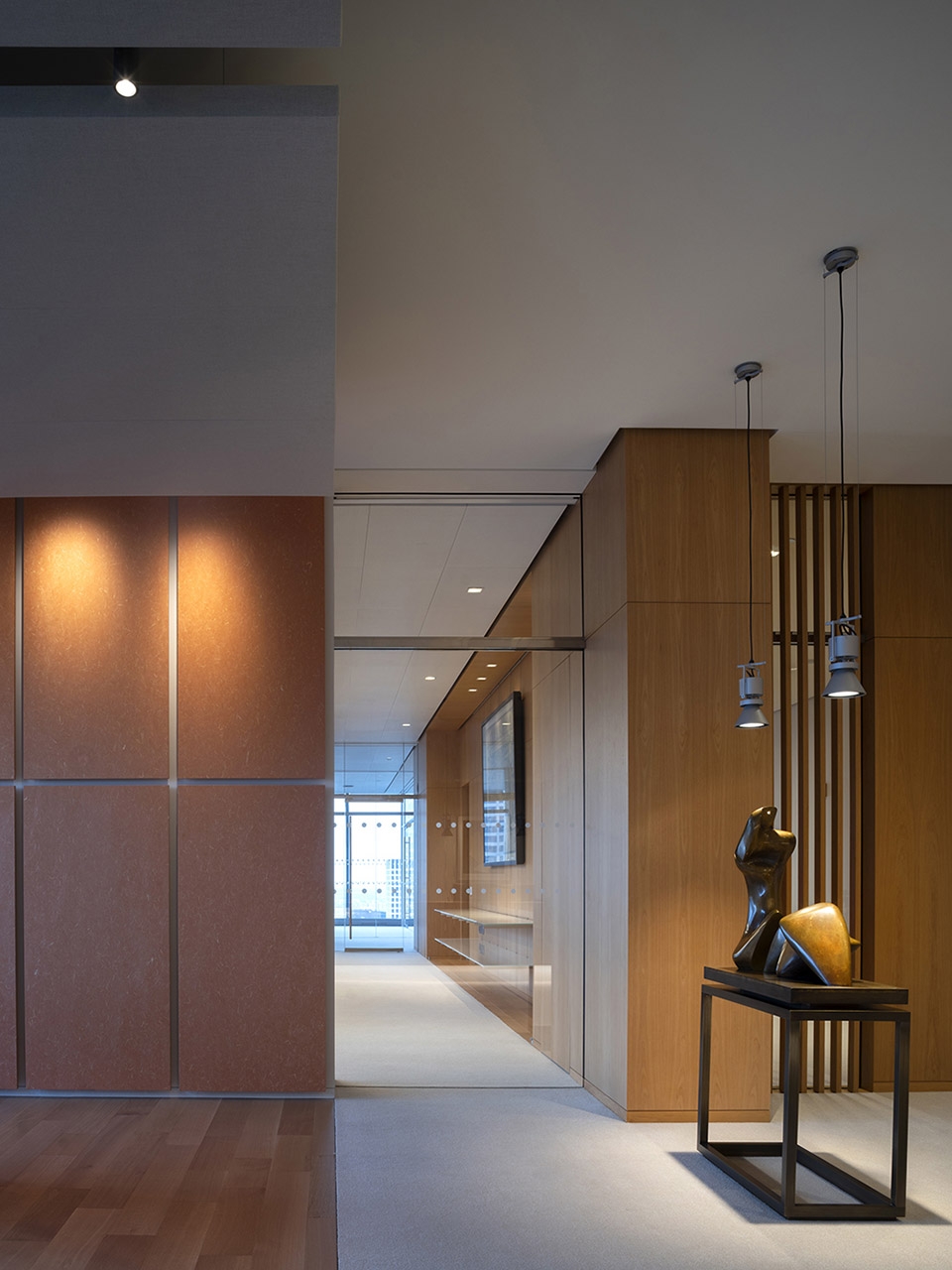
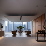
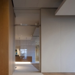
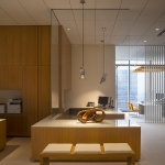
▼办公室入口及接待区,entrance and reception area ©Nic Lehoux
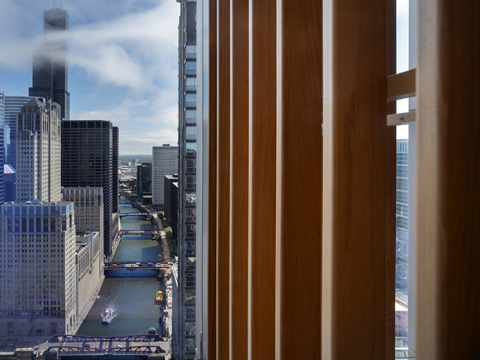
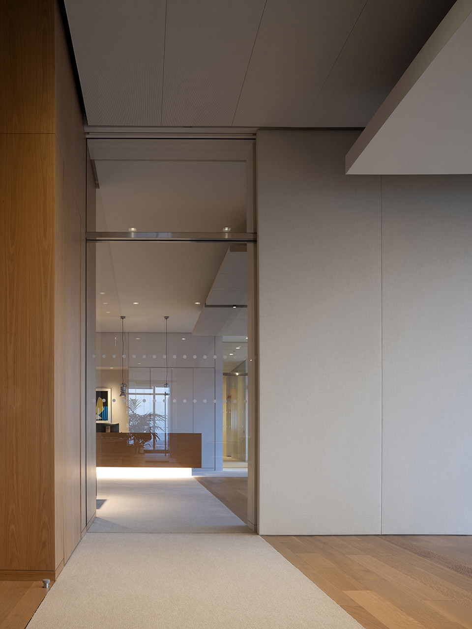
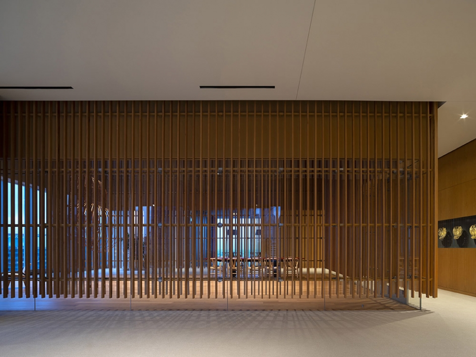
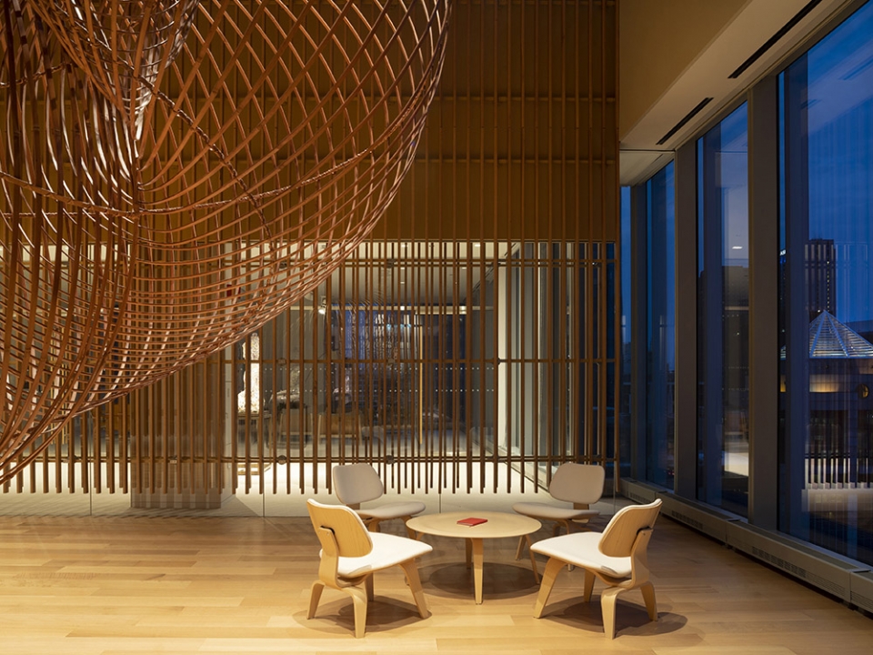
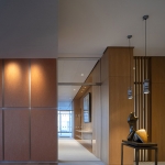
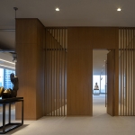
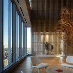
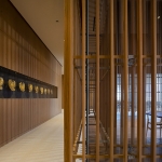
室内空间采用了从地板延伸到天花板的天然木材墙面、玻璃隔断和吊顶天花板,通过组合来构成不同的工作区域。这些元素高度的灵活性和透明性使得访客与员工即使在不透明材料分隔的最私密的区域也能欣赏到令人惊叹不已的美景。木墙消隐成垂直板条,维持一定程度的私密与光亮,同时也是项目的主要特征元素。访客通过这一元素指引抵达冬季花园,这是一个两层高的多功能空间,是项目跳动的心脏。
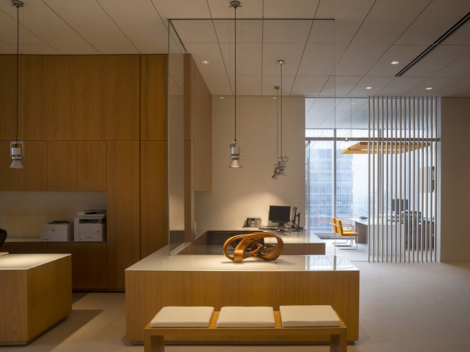
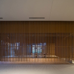
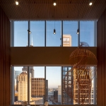
The interiors feature floor-to-ceiling natural wood walls, glass partitions and suspended panels, which, depending on the combinations, outline the different work areas. Great flexibility and transparency of the elements allows visitors and employees to enjoy breathtaking views even in the most private areas, which are delimited by opaque surfaces. Wooden walls, which are dematerialized in vertical slats to calibrate the degree of privacy and brightness, characterize the main lines of the project. These constitute the leitmotiv that accompanies the visitor through to the discovery of the Winter Garden, a multi-functional double-height environment that represents the beating heart of the project.
▼空间采用天然木材墙面,玻璃隔断和吊顶天花板,the interiors feature floor-to-ceiling natural wood walls, glass partitions and suspended panels ©Nic Lehoux
▼玻璃隔断与木墙限定不同空间,wood walls, glass partitions define different spaces ©Nic Lehoux
▼南侧长廊与冬季花园外墙,south hallway and exterior of Winter Garden ©Nic Lehoux
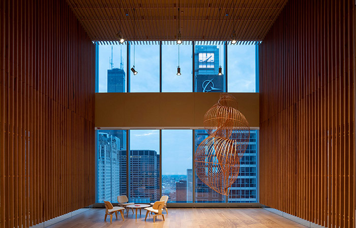
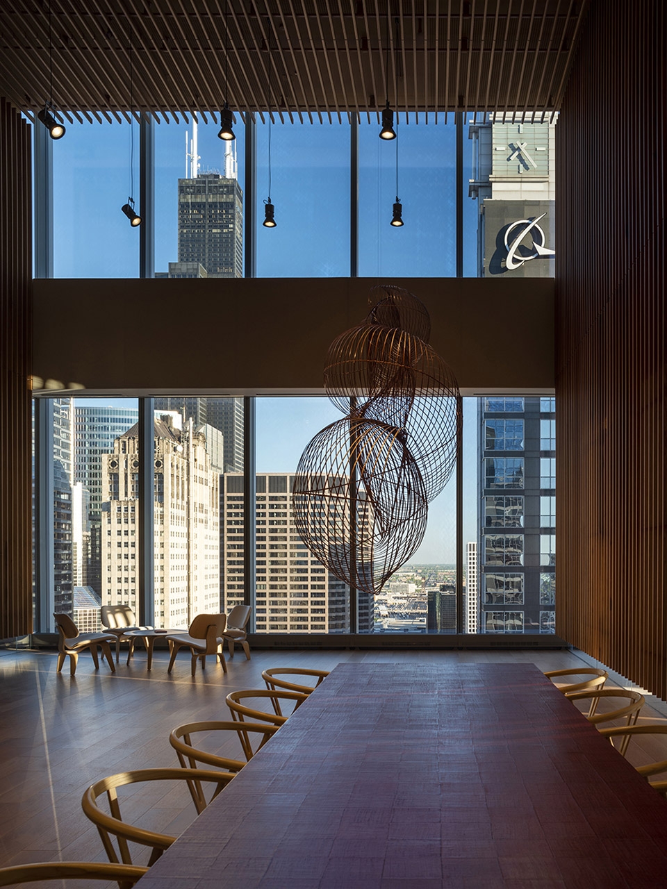
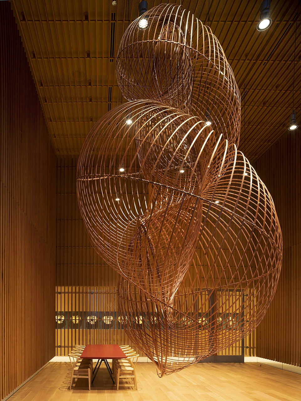
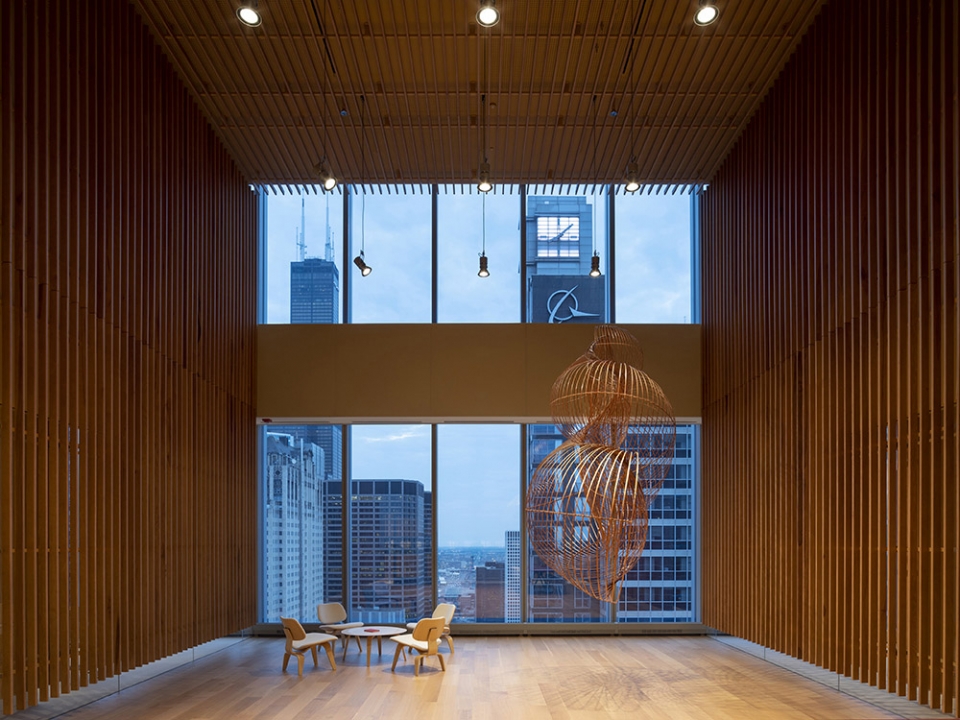
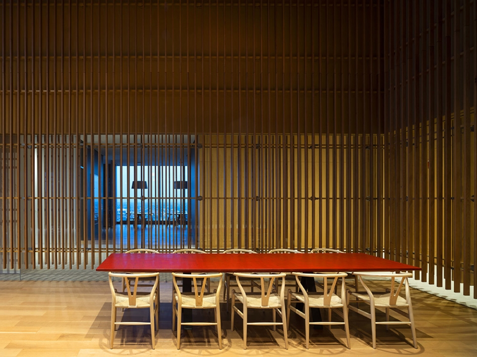
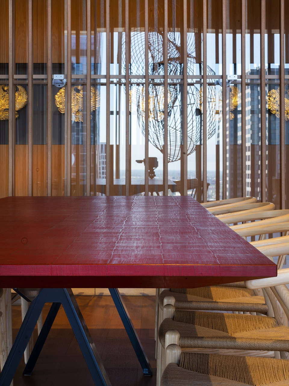
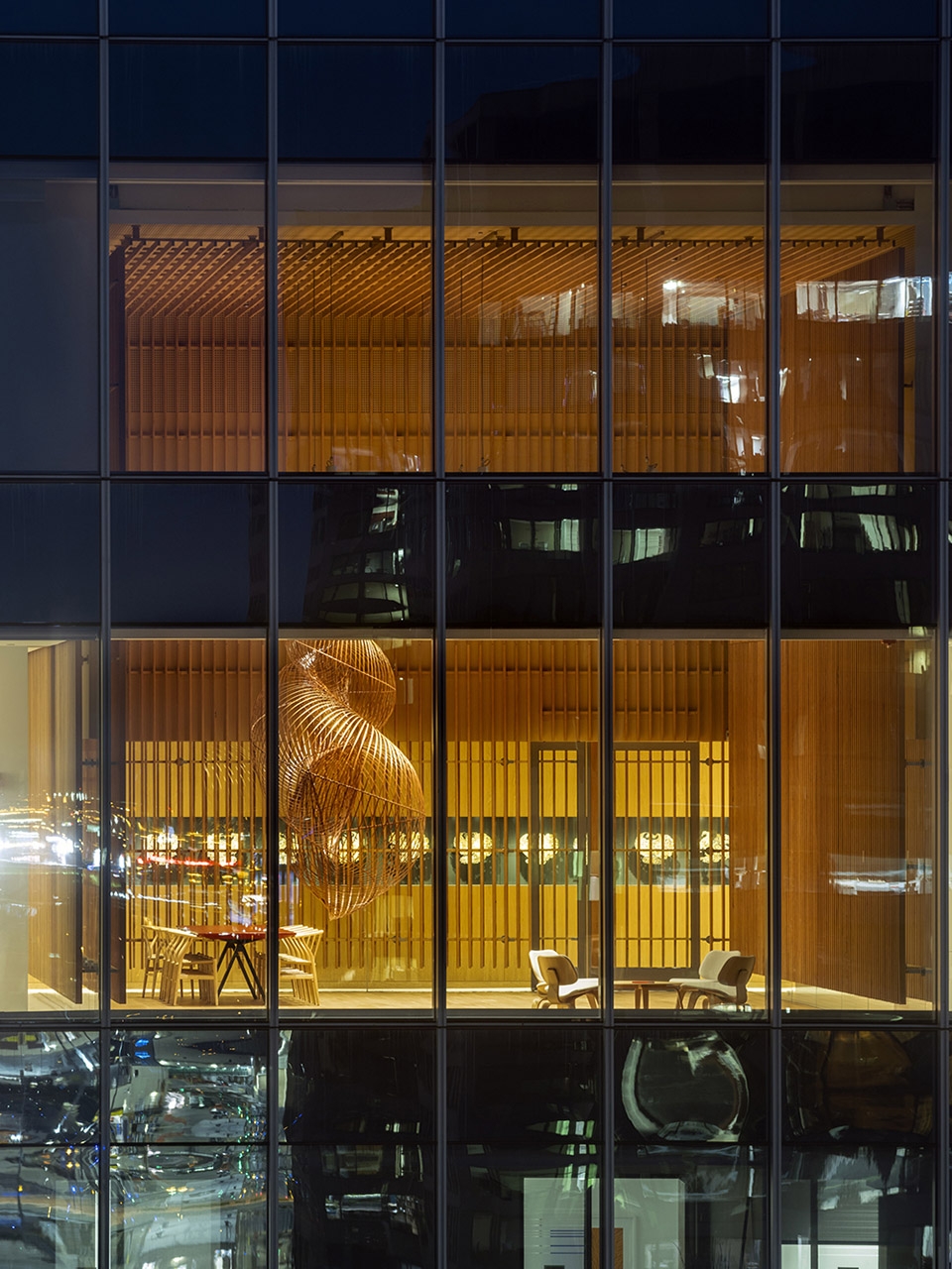
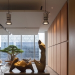
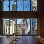
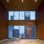
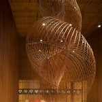
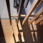
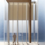
两位建筑师继续描述道:“从弥漫在芝加哥的蓝调音乐的结构中,我们吸取到‘张力与松弛’的概念,3.60米高的空间对于办公室来说绝对是不同寻常的,这使得我们能够交替悬挂各种元素如织物面板或者将雕塑元素放置于地板上,形成不同的高度变化。收缩和悬浮的游戏在冬季花园中发挥到极致:一个悬浮于城市上空的独特空间,一个物质与感知的隔离空间,能够容纳音乐、艺术和活动如冥想和阅读。” 根据视角不同,冬季花园的表皮由两排互不对齐的悬垂木条组成,中间夹有的透明玻璃隔断被消解或变得不再透明,产生不同的视角并激活了一个有趣的光影游戏。内部环境如同一个灯箱,允许光线穿透双层遮光和滤光窗帘系统,木条分隔相邻空间。房间布置有日本艺术家Ueno Masao设计的竹子悬挂雕塑和Junko Kirimoto设计的日本漆面桌子。空间具有东方风情,比例合理,符合Alvisi Kirimoto studio的所富有的意大利和日本情愫。
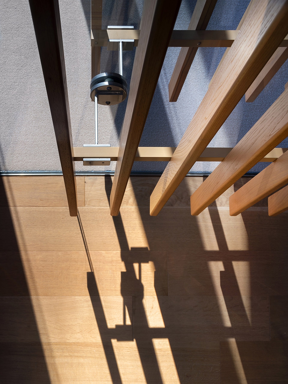
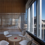
▼冬季花园的表皮由两排互不对齐的悬垂木条和中间透明玻璃隔断构成,the skin of the Winter Garden, composed of two rows of suspended wooden slats that do not align with each other, frame a central transparent glass partition ©Nic Lehoux
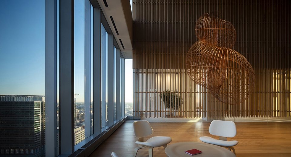
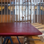
Depending on the point of view, the skin of the Winter Garden, composed of two rows of suspended wooden slats that do not align with each other, frame a central transparent glass partition, which, dissolves or becomes opaque, generating multiple perspectives and igniting an interesting game of lights and shadows. Similar to a light box, the environment allows the light to be directed through a system of double darkening and filtering curtains, and to diffuse the adjacent spaces with the wooden slats. The room is completed by a bamboo suspended sculpture by Japanese artist Ueno Masao, and a table designed by Junko Kirimoto, with a Japanese lacquer finish.The space has an oriental touch and wisely measured proportions, in line with the Italian and Japanese sensibilities that animate the Alvisi Kirimoto studio.”From the structure of the Blues, a music that permeates the city of Chicago…”, the Architects continue, “…we have taken the concept of ‘Tension and Release’. The 3,60 m ceiling height, which is absolutely extraordinary for an office, has allowed us to alternate suspended elements such as fabric panels, with sculptural elements resting on the floor and left at their original height. This compression and suspension game culminates in the volume of the Winter Garden: a unique space suspended in the city void, a material and tactile diaphragm that contains a space for music, art and events, as well as for meditation and reading.”
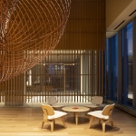
▼冬季花园内部,Winter Garden ©Nic Lehoux
▼悬挂的竹子雕塑与日本漆面桌子,a bamboo suspended sculpture and a Japanese lacquer finish table ©Nic Lehoux
▼光线能够穿透双层遮光和滤光窗帘系统,木条分隔相邻空间,the environment allows the light to be directed through a system of double darkening and filtering curtains, and to diffuse the adjacent spaces with the wooden slats ©Nic Lehoux
▼空间细部,space detail ©Nic Lehoux
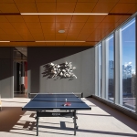
从家具如工作台和自助餐厅桌子到灯光的布置和分级,项目的所有元素都是精心定制和相互协调的。色彩使用也很重要,有时候给人以宁静感,有时限定出一片空间或某种功能区域。色系包括游戏室天花板和办公室吊顶的亮橙色、餐厅墙面和面板形成对比的灰色和鲜艳红色、入口处日本墙纸柔和的深褐色、开放式工作站空间崭新的白色,塑造了一个色彩丰富的空间。
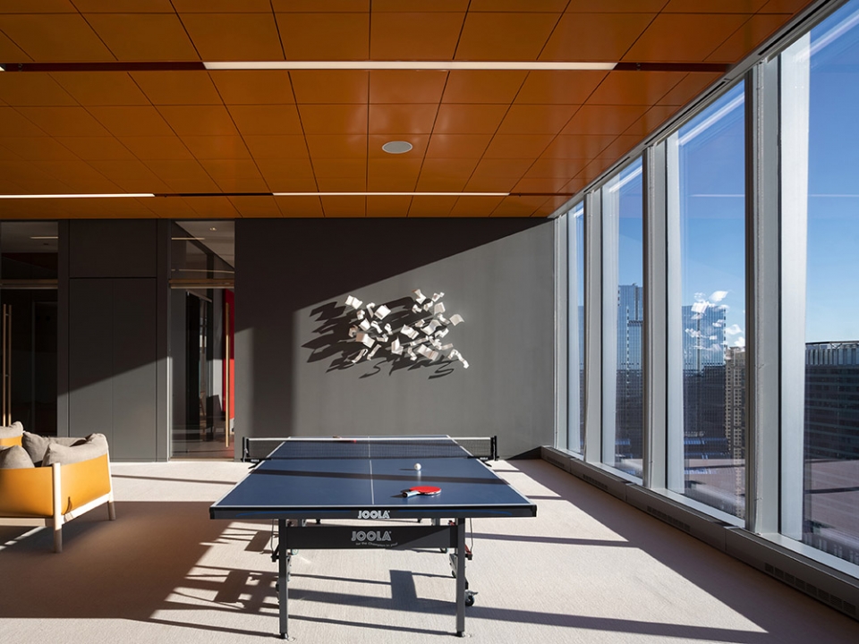
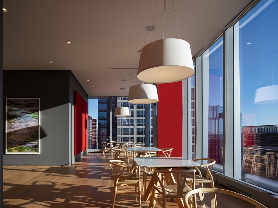
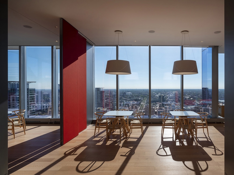
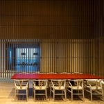
All aspects of the project have been carefully tailored and harmonized, from custom-designed furniture, such as the workstations and tables of the cafeteria, to the arrangement and choice of gradation of the lights. The use of color is weighted: at times it gives serenity, at others it draws space or defines a function. Colors range from the bright orange of the playroom ceiling and the suspended panels in the offices, to the intense red of the panels in contrast with the gray walls of the restaurant area, from the soothing rust of Japanese wallpaper at the entrance, to the regenerating white of the open workstation space.
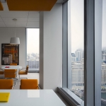
▼亮橙色的游戏室天花板和办公室吊顶天花板,the bright orange of the playroom ceiling and the suspended panels in the offices ©Nic Lehoux
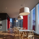
▼餐厅内与灰色墙面形成对比的鲜艳红色面板,the intense red of the panels in contrast with the gray walls of the restaurant area ©Nic Lehoux
▼柔和色系的办公室与助理工作台,offices and assistant workstation in soft tone ©Nic Lehoux
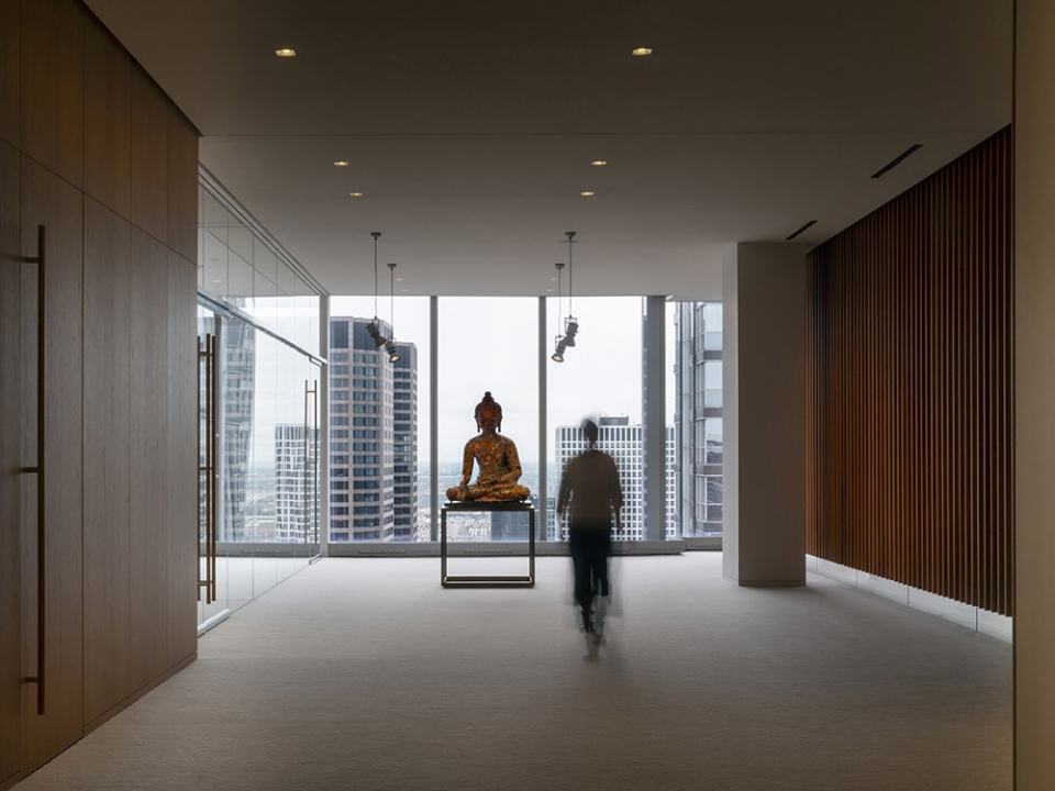
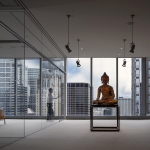
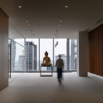
最后也很重要的一点是,艺术也起着重要的决定性作用:办公室内部有一条超过1000平方米的整体展览路线,专门用于展示业主的收藏品,这一系列空间与城市相互渗透、重叠,产生了意想不到的非传统视角。
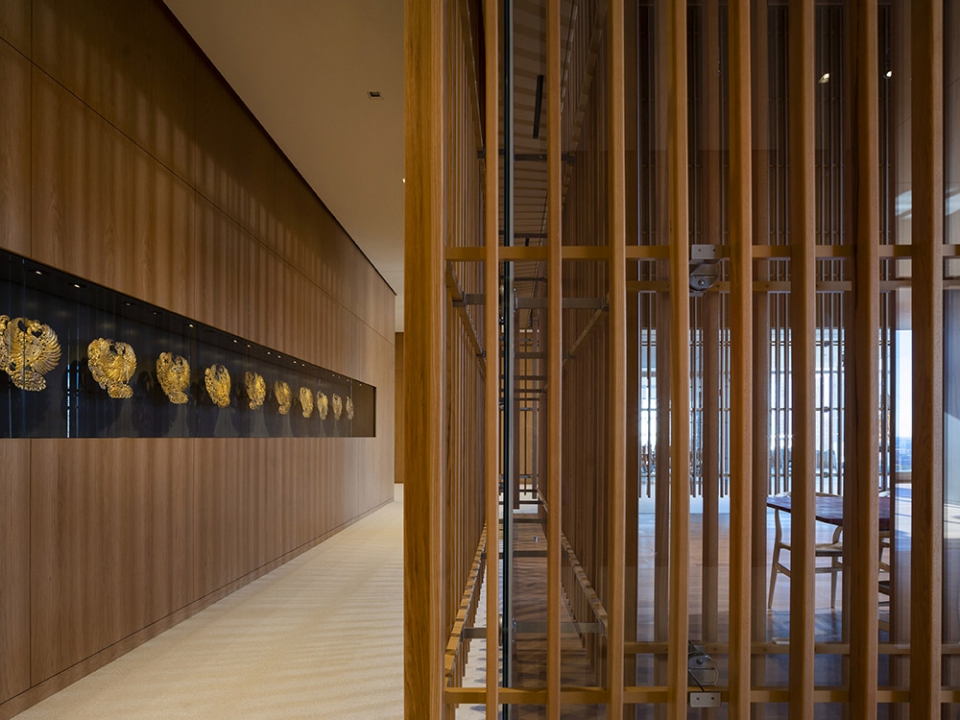
Last but not least, art plays a definitive role: the offices host a holistic exhibition path of over 1,000 sq. m dedicated to some of the client’s collection pieces, in a succession of spaces that interpenetrate, overlapping with the city and generating unexpected and unconventional points of view.
▼展览藏品的走廊,corridor displays the client‘s collections ©Nic Lehoux
▼室内夜景,interior night view ©Nic Lehoux
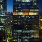
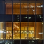
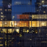
▼建筑夜景,night scene ©Nic Lehoux
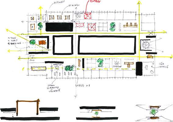
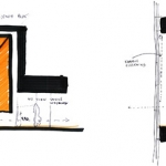
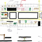
▼草图,sketches ©Alvisi Kirimoto
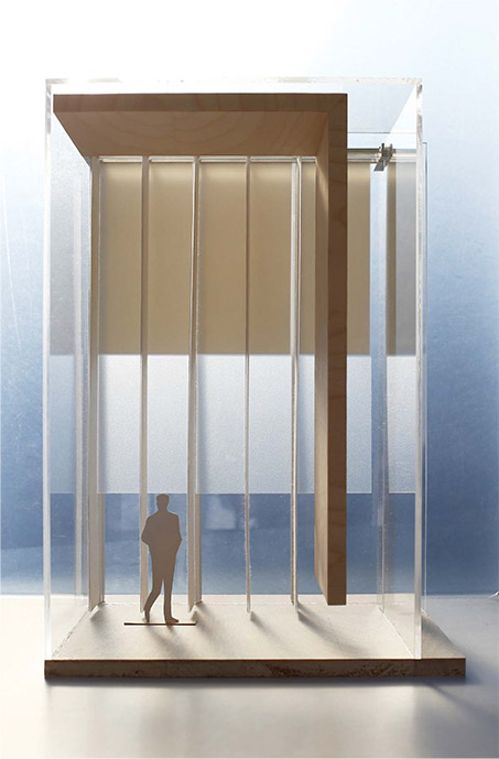
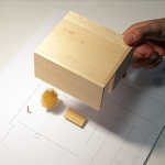
▼模型推敲,model process ©Alvisi Kirimoto
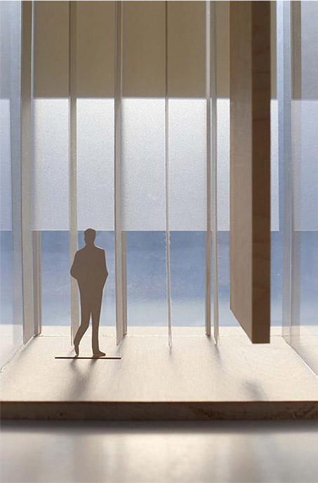
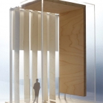
▼模型,model ©Alvisi Kirimoto
▼平面,plan ©Alvisi Kirimoto
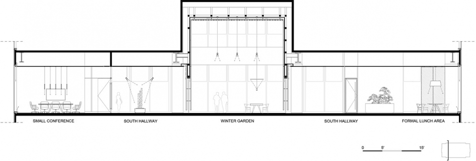
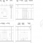
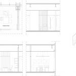
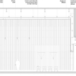
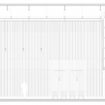
▼长剖面,long section ©Alvisi Kirimoto
▼横剖面,cross section ©Alvisi Kirimoto
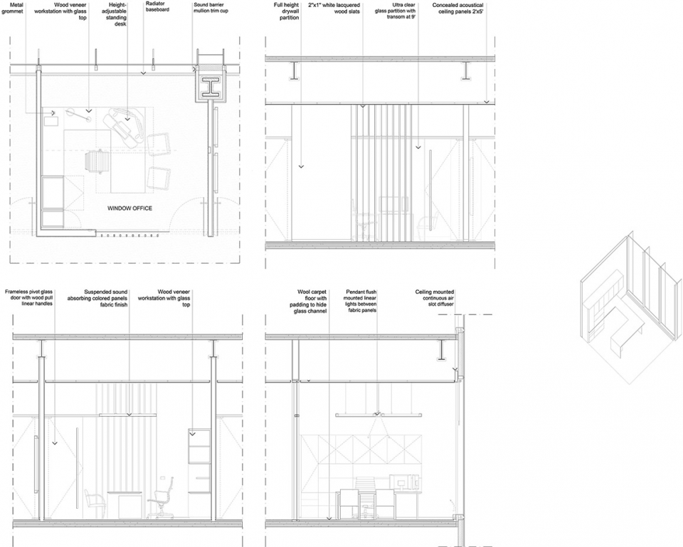
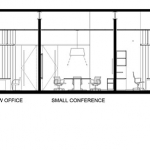
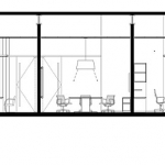
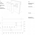
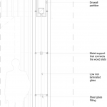
▼标准办公室构造,typical office construction ©Alvisi Kirimoto
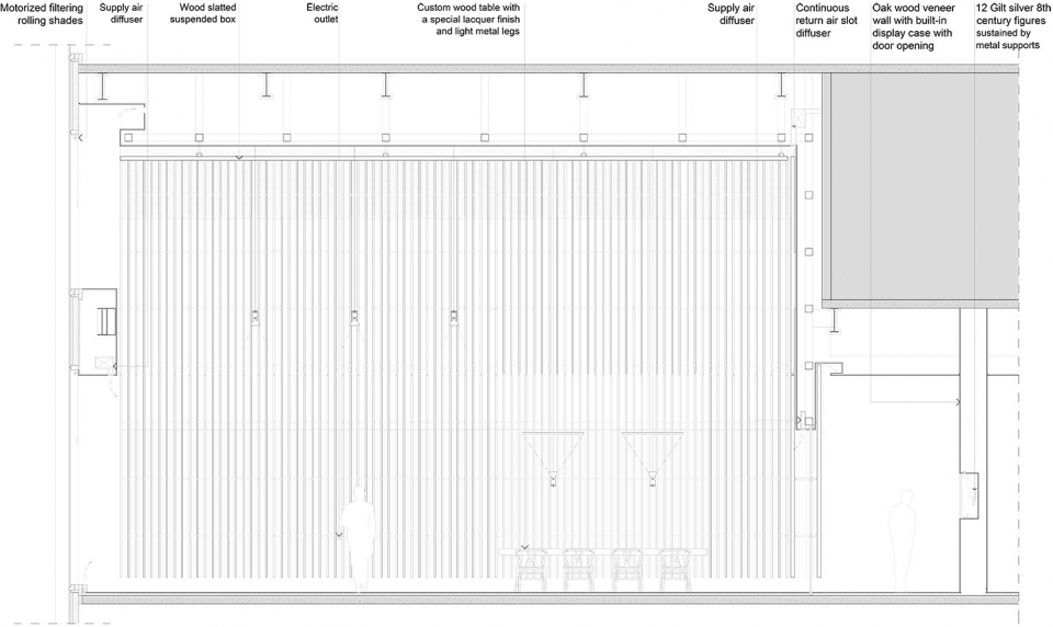
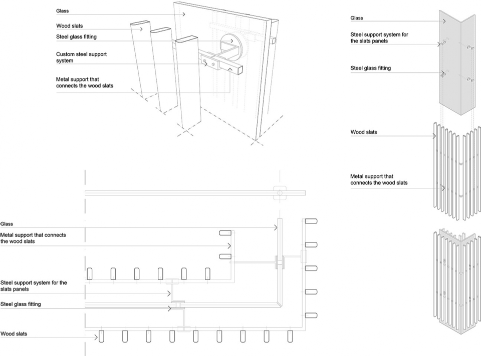
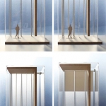
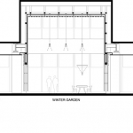
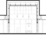
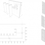
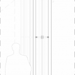
▼冬季花园构造,Winter Garden construction ©Alvisi Kirimoto
Project name: Private Office
Location: Chicago, Illinois
Completion date: 2018
Gross square footage: 2570 sqm
Client: Private
Architect:
Alvisi Kirimoto in collaboration with CannonDesign
Alvisi Kirimoto: concept design, schematic design, design development, furniture design, construction drawings supervision, site supervision; CannonDesign: initial planning and intent, design collaboration, local and executive architect, construction drawings
Project team:
Alvisi Kirimoto team: Massimo Alvisi, Junko Kirimoto, Carolina Ossandon Avetikian, Alessio Montanari, Donato Labella, Silvia Rinalduzzi; CannonDesign team: Mark Hirons, Meg Osman, David Pugh, Angela Furman, Taofik Lasisi
Project Management: ConopCo Project Management
General contractor:Executive Construction Inc.
Architect of record: CannonDesign
Interior designer: Alvisi Kirimoto
Engineers: Structural, MEP and lighting Engineer: CannonDesign
Consultants:
Acoustic consultant: Arup; AV and security services: Environmental System Design, Inc. and Netrix; Furniture: Kayhan; Kitchen Consultant: S2o Consultants
Winter Garden Sculpture Artist: Ueno Masao
Photographer: ©Nic Lehoux
More: Alvisi Kirimoto 。更多关于:Alvisi Kirimoto on gooood
